Styling the RadMenuItem
In order to style RadMenuItem elements, you can set the ItemContainerStyle property of the RadMenu or a create an implicit style targeting RadMenuItem.
When using ItemContainerStyle with static items, it will be applied only to the direct children of the RadMenu - the top-level items. If you want their child items to have the same style you have to manually set the ItemContainerStyle property of their parents.
When using ItemContainerStyle with dynamic items, its value gets inherited through the hierarchy thanks to the HierarchicalDataTemplate. You are free to break the inheritance, when needed, by using multiple nested HierarchicalDataTemplates and by setting the ItemContainerStyle property of each of them. To learn more about using RadMenu with dynamic data read here.
Choosing the style for an item depending on its position in the hierarchy can be done by using the ItemContainerStyleSelector property. Read more about selectors here.
Targeting the RadMenuItem Element
In order to style all RadMenuItem elements in the application, you can create an implicit style targeting RadMenuItem as demonstrated in the Example 1.
Example 1: Styling RadMenuItem
<Grid>
    <Grid.Resources>
         <!-- If you are using the NoXaml binaries, you will have to base the style on the default one for the theme like so:
        <Style TargetType="telerik:RadMenuItem" BasedOn="{StaticResource RadMenuItemStyle}">-->
        <Style TargetType="telerik:RadMenuItem">
            <Setter Property="Background" Value="Red" />
            <Setter Property="IconColumnWidth" Value="0" />
        </Style>
    </Grid.Resources>
    <telerik:RadMenu VerticalAlignment="Top" >
        <telerik:RadMenuItem Header="File">
            <telerik:RadMenuItem Header="File 1" />
            <telerik:RadMenuItem Header="File 2" />
            <telerik:RadMenuItem Header="File 3" />
        </telerik:RadMenuItem>
        <telerik:RadMenuItem Header="Edit" />
    </telerik:RadMenu>
</Grid>
Figure 1: RadMenuItems with red Background in the Fluent theme
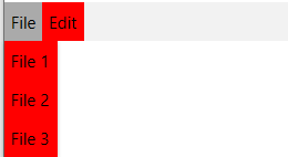
In Figure 1 you can observe that the clicked menu item has a different background. Inside the ControlTemplate of the RadMenuItem there are triggers/visual states, which set the Background when an item is clicked and that value takes precedence over the value from the implicit style. In order to change this behavior, you can extract and modify the ControlTemplate of the RadMenuItem for the theme(s) that you are using.