LayoutControlTabGroup
LayoutControlTabGroup is one of the few layout groups supported by the RadLayoutControl. LayoutControlTabGroup behaves a little differently than the other types of groups. Basically, it its children are displayed in a tab control and each tab item is represented by a LayoutControlTabGroupItem element.
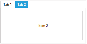
Example 1: Setting up LayoutControlTabGroup
<telerik:RadLayoutControl>
    <telerik:LayoutControlTabGroup>
        <telerik:LayoutControlTabGroupItem Header="Tab 1">
            <Button Content="Item 1" />
        </telerik:LayoutControlTabGroupItem>
        <telerik:LayoutControlTabGroupItem Header="Tab 2">
            <Button Content="Item 2" />
        </telerik:LayoutControlTabGroupItem>
    </telerik:LayoutControlTabGroup>
</telerik:RadLayoutControl>
Figure 1: LayoutControlTabGroup
If a UIElement is added as a direct child of a tab group, it will be automatically wrapped into a LayoutControlTabGroupItem.
The header of the tab group item can be set through its Header property. The property is of type Object which allows you to place any visual (or not) element in it.
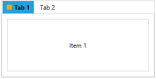
Example 2: Setting up the header of LayoutControlTabGroupItem
<telerik:RadLayoutControl>
    <telerik:LayoutControlTabGroup>
        <telerik:LayoutControlTabGroupItem>
            <telerik:LayoutControlTabGroupItem.Header>
                <StackPanel Orientation="Horizontal">
                    <Rectangle Width="10" Height="10" Fill="Orange" Margin="0 0 5 0" />
                    <TextBlock Text="Tab 1" FontWeight="Bold" />
                </StackPanel>
            </telerik:LayoutControlTabGroupItem.Header>
            <Button Content="Item 1" />
        </telerik:LayoutControlTabGroupItem>
        <telerik:LayoutControlTabGroupItem Header="Tab 2" />
    </telerik:LayoutControlTabGroup>
</telerik:RadLayoutControl>
Figure 2: LayoutControlExpanderGroup with UIElements in its header
LayoutControlTabGroupItem is also a layout group control which means that you can move and arrange it in the layout. In other words the item can be dragged outside of the tab control group. Also, you can drag an element from the layout and place it in the tab strip area which will automatically wrap it into a LayoutControlTabGroupItem.
Selection
The tab group allows you to select its child tab items. The selection can be change through the SelectedItem property of LayoutControlTabGroup or the IsSelected property LayoutControlTabGroupItem.
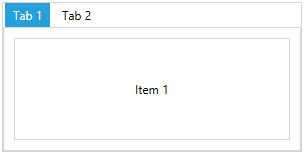
Example 3: Setting up the selection in LayoutControlTabGroup
<telerik:RadLayoutControl>
    <telerik:LayoutControlTabGroup>
        <telerik:LayoutControlTabGroupItem Header="Tab 1">
            <Button Content="Item 1" />
        </telerik:LayoutControlTabGroupItem>
        <telerik:LayoutControlTabGroupItem Header="Tab 2" IsSelected="True">
            <Button Content="Item 2" />
        </telerik:LayoutControlTabGroupItem>
    </telerik:LayoutControlTabGroup>
</telerik:RadLayoutControl>
Figure 3: LayoutControlTabGroupItem selection