GroupFooterCellStyleSelector
The GroupFooterCellStyleSelector property of RadGridView can be used to style group footer rows differently based on a specific condition.
Bear in mind that the GroupFooterCellStyle takes precedence over the GroupFooterCellStyleSelector and will overwrite it if both are defined simultaneously.
To do so, first create a new class that inherits the StyleSelector class and override its SelectStyle method:
Example 1: The GroupFooterCellStyleSelector class
public class GroupFooterCellStyleSelector : StyleSelector
{
    public override Style SelectStyle(object item, DependencyObject container)
    {
        var cell = container as GridViewGroupFooterCell;
        var footerRow = cell.ParentRow as GridViewGroupFooterRow;
        var group = footerRow.Group as QueryableCollectionViewGroup;

        if (group.ItemCount > 1)
        {
            return BigGroupStyle;
        }
        else
        {
            return SmallGroupStyle;
        }
    }

    public Style BigGroupStyle { get; set; }
    public Style SmallGroupStyle { get; set; }
}
Public Class GroupFooterCellStyleSelector
    Inherits StyleSelector

    Public Overrides Function SelectStyle(ByVal item As Object, ByVal container As DependencyObject) As Style
        Dim cell = TryCast(container, GridViewGroupFooterCell)
        Dim footerRow = TryCast(cell.ParentRow, GridViewGroupFooterRow)
        Dim group = TryCast(footerRow.Group, QueryableCollectionViewGroup)

        If group.ItemCount > 1 Then
            Return BigGroupStyle
        Else
            Return SmallGroupStyle
        End If
    End Function

    Public Property BigGroupStyle() As Style
    Public Property SmallGroupStyle() As Style
End Class
In the XAML file, define the style selector as a resource and set the properties of the BigGroupStyle and SmallGroupStyle:
Example 2: Setting the BigGroupStyle and SmallGroupStyle
<Grid.Resources>
    <my:GroupFooterCellStyleSelector x:Key="GroupFooterCellStyleSelector">
        <my:GroupFooterCellStyleSelector.BigGroupStyle>
            <Style TargetType="telerik:GridViewGroupFooterCell">
                <Setter Property="Background" Value="Red"/>
            </Style>
        </my:GroupFooterCellStyleSelector.BigGroupStyle>
        <my:GroupFooterCellStyleSelector.SmallGroupStyle>
            <Style TargetType="telerik:GridViewGroupFooterCell">
                <Setter Property="Background" Value="Yellow" />
            </Style>
        </my:GroupFooterCellStyleSelector.SmallGroupStyle>
    </my:GroupFooterCellStyleSelector>
</Grid.Resources>
The "my:" prefix before GroupFooterCellStyleSelector specifies the mapping for the namespace of the project: xmlns:my="..."
Finally, set the GroupFooterCellStyleSelector property of the chosen column:
Example 3: Setting the GroupFooterCellStyleSelector property
<telerik:GridViewDataColumn DataMemberBinding="{Binding Name}" GroupFooterCellStyleSelector="{StaticResource GroupFooterCellStyleSelector}" />
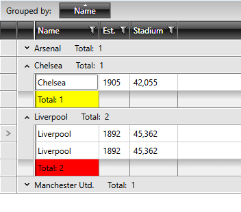
Figure 1: The group footer cells styled using the GroupFooterCellStyleSelector property