Customize a ContainerShape
This tutorial describes how to customize the default look and feel of the RadDiagramContainerShape.
Edit the Header
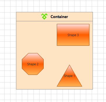
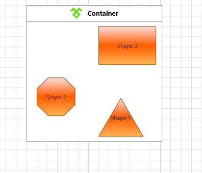
In order to customize the content of the header part of the RadDiagramContainerShape, you can use the Content property. For instance, if you wish to display an icon in the header you can define the following layout:
<telerik:RadDiagram>
    <telerik:RadDiagramContainerShape Width="264" Position="120,120">
        <telerik:RadDiagramContainerShape.Content>
            <Grid Height="Auto">
                <Grid.ColumnDefinitions>
                    <ColumnDefinition Width="Auto" />
                    <ColumnDefinition Width="*" />
                </Grid.ColumnDefinitions>
                <Image Grid.Column="0"
                        Width="25"
                        Height="25"
                        HorizontalAlignment="Center"
                        VerticalAlignment="Center"
                        Source="TelerikIcon.png" />
                <TextBlock Grid.Column="1"
                            Margin="10,0,0,0"
                            VerticalAlignment="Center"
                            FontSize="13"
                            FontWeight="Bold"
                            Text="Container" />
            </Grid>
        </telerik:RadDiagramContainerShape.Content>
        <telerik:RadDiagramShape Content="Shape 1"
                                    Geometry="{telerik:CommonShape ShapeType=TriangleShape}"
                                    Position="260,300" />
        <telerik:RadDiagramShape Content="Shape 2"
                                    Geometry="{telerik:CommonShape ShapeType=OctagonShape}"
                                    Position="140,260" />
        <telerik:RadDiagramShape Content="Shape 3"
                                    Geometry="{telerik:CommonShape ShapeType=RectangleShape}"
                                    Position="260,160" />
    </telerik:RadDiagramContainerShape>
</telerik:RadDiagram>
Edit the ControlTemplate
You can further customize the appearance of the RadDiagramContainerShape by editing its default style and template.
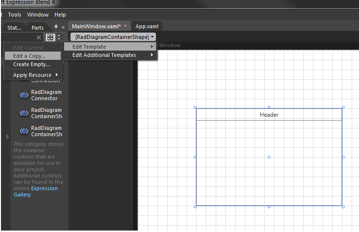
In Expression Blend, add a RadDiagram control and a RadDiagramContainerShape onto it (accessible via the Assets panel).
Select the container shape and in the 'Objects and Timeline' panel right-click the object or use the dropdown as shown in the picture below. Select 'Edit template > Edit a copy', this will create a copy of the default template which you can customize.
If you choose to define the style in Application, it would be available for the entire application. This allows you to define a style only once and then reuse it where needed.
After clicking 'OK', Expression Blend will generate the default style of the RadDiagramContainerShape control in the Resources section of your UserControl/application. The properties available for the style will be loaded in the 'Properties' pane and you will be able to modify their default values.
If you want to change the ControlTemplate elements of the RadDiagramContainerShape select the style in the 'Objects and Timeline' pane, right-click on it and choose Edit Template -> Edit Current. In the same pane the element parts for the RadDiagramContainerShape's template will get loaded.
Please note that at the moment Expression Blend seems not to extract well the default template as it can't extract the ItemsSource applied on the ConnectorsControl within the template. This is why you'll have to manually add it
The final definition of the ConnectorsControl should look like this:
<Telerik_Windows_Controls_Diagrams_Primitives:ConnectorsControl x:Name="ConnectorsControl"
                                                            Grid.RowSpan="2"
                                                            ItemContainerStyle="{TemplateBinding ConnectorStyle}"
                                                            ItemsSource="{TemplateBinding Connectors}"
                                                            Visibility="Collapsed" />
The various things which apply to ControlTemplates in general and customization of RadDiagram shapes in particular apply to the RadDiagramContainerShape as well. This means that you can modify the ControlTemplate elements definitions to better fit your requirements.
For example, let's change the default Background color of the container in the style we extracted:
<Style x:Key="RadDiagramContainerShapeStyle" TargetType="{x:Type telerik:RadDiagramContainerShape}">
    <Setter Property="Background" Value="#FFE4C4"/>
    ...
</Style>