Align and Snap
RadDiagram gives you the ability to Align the selected RadDiagramItems or Snap them with DiagramCommands.
Please note that the examples in this tutorial are showcasing Telerik Windows8 theme. In the Setting a Theme article you can find more information on how to set an application-wide theme.
Align
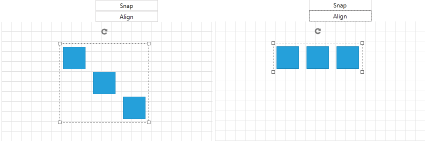
The Align DiagramCommand makes the Selected Items align to Top, Bottom, Left, Right, Middle or Center.
Note that the IsSnapToGridEnabled property of the RadDiagram must be set to True (default). Below you can see an example code of how to use the Align Command:
<Grid>
    <Grid.RowDefinitions>
        <RowDefinition Height="Auto" />
        <RowDefinition Height="*" />
    </Grid.RowDefinitions>

    <StackPanel>
        <telerik:RadButton Width="125" Command="telerik:DiagramCommands.Snap" CommandTarget="{Binding ElementName=diagram}" Content="Snap" />
        <telerik:RadButton Width="125" Command="telerik:DiagramCommands.Align" CommandTarget="{Binding ElementName=diagram}" Content="Align" />
    </StackPanel>

    <telerik:RadDiagram Grid.Row="1" x:Name="diagram">
        <telerik:RadDiagramShape Width="45" Height="45" Geometry="{telerik:CommonShape ShapeType=RectangleShape}" Position="123 50" />
        <telerik:RadDiagramShape Width="45" Height="45" Geometry="{telerik:CommonShape ShapeType=RectangleShape}" Position="183 100" />
        <telerik:RadDiagramShape Width="45" Height="45" Geometry="{telerik:CommonShape ShapeType=RectangleShape}" Position="243 150" />
    </telerik:RadDiagram>
</Grid>
You can give argument to the Align Command with the CommandParameter property. You can set Top, Bottom, Left, Right, Middle or Center Alignment like so:
<StackPanel>
    <telerik:RadButton Width="125" Command="telerik:DiagramCommands.Align" CommandParameter="Right" CommandTarget="{Binding ElementName=diagram}" Content="Align" />
</StackPanel>
Please keep in mind that you cannot use HorizontalAlignment and VerticalAlignment of the RadDiagramItem because the Diagram is created over a Canvas. In other word, use only the Position property.
Snap To Grid
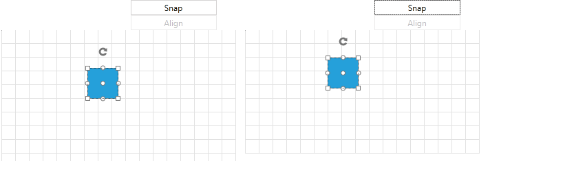
The RadDiagram snapping features allow you to move the diagram items exactly to a point coordinates. This is very useful when you need to create more accurate layouts. Essentially Snapping means changing the RadDiagramItems Position by multiplying the X and Y coordinates by a particular value - RadDiagram SnapX and SnapY accordingly.
In the RadDiagram the snapping is enabled by default and in order to disable it, you can set the IsSnapToGridEnabled property to False. Also, please note that the default value of the RadDiagram SnapX and SnapY properties is 20, but you can change it to any integer greater than or equal to 1.
Once the snapping is enabled, when a DiagramItem is dragged its X and Y coordinates increase or decrease with the SnapX and SnapY value. Below you can see the selected item being snapped with the Snap Command.
<Grid>
    <Grid.RowDefinitions>
        <RowDefinition Height="Auto" />
        <RowDefinition Height="*" />
    </Grid.RowDefinitions>

    <StackPanel>
        <telerik:RadButton Width="125" Command="telerik:DiagramCommands.Snap" CommandTarget="{Binding ElementName=diagram}" Content="Snap" />
        <telerik:RadButton Width="125" Command="telerik:DiagramCommands.Align" CommandTarget="{Binding ElementName=diagram}" Content="Align" />
    </StackPanel>

    <telerik:RadDiagram Grid.Row="1" GridCellWidth="20" GridCellHeight="20" x:Name="diagram">
        <telerik:RadDiagramShape Width="45" Height="45" Geometry="{telerik:CommonShape ShapeType=RectangleShape}" Position="125 55" />
    </telerik:RadDiagram>
</Grid>
Snap To Items
You are also able to snap items to other items while dragging. You can enable this feature by setting the RadDiagram IsSnapToItemsEnabled property to True. This feature is also enabled by default and you will have to explicitly set the property to False to disable it.
Please keep in mind that when both snapping features are enabled (which is the default state of the RadDiagram), the SnapToItems feature has a higher priority.
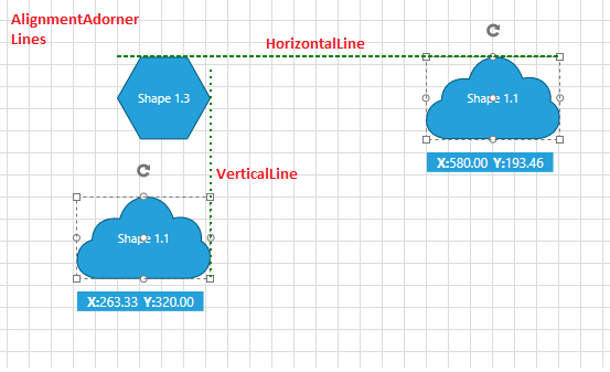
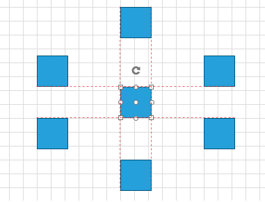
The SnapToItems feature is visualized through a set of thin indication lines helping you snap the dragged item/s to other static items:
SnappingEngine
The SnapToItems feature of the Diagramming Framework uses a SnappingEngine to determine how an item should be snapped to a set of static items. The class exposes two virtual methods which you can override in your application to customize the default snap to items behavior. Both methods are executed for all possible pairs of items formed of one dragged item from the collection of currently dragged items and one static item from all static items on the diagramming surface (viewport). Also both methods return a value of type MatchingInfo - this object describes a list of matching points and a double value. The MatchingPoints collection is populated with the points where the compared items match. These points are then used to draw the snapping lines. The double value, named Delta, is used to determine the snapping.
Please have in mind that the MachingInfo with minimum Delta value is used to snap the items. All other MatchingInfo results returned by the SnappingEngine methods are rejected.
GetHorizontalMatchingOverride - this method matches the Top and Bottom values of the bounds of two DiagramShapes - one static and one dragged, to find the matching points between them. The method also determines how the dragged shape can be snapped to the static shape and what horizontal snapping lines should be displayed.
GetVerticalMatchingOverride - this method matches the Left and Right values of the bounds of two items - one static and one dragged item, to find the matching points between them. The method also determines how the dragged item can be snapped to the static item and what vertical snapping lines should be displayed.
Appearance
The alignment lines are part of the AlignmentAdorner and therefore their appearance can be controlled through the following set of properties:
AlignmentAdorner.HorizontalLineStroke - this property is of type Brush and it specifies how the horizontal alignment lines are painted.
AlignmentAdorner.HorizontalLineStrokeDashArray - this property gets or sets a collection of Double values that indicate the pattern of dashes and gaps that is used to outline the horizontal alignment lines.
AlignmentAdorner.HorizontalLineStrokeThickness - this property is of type double and it gets or sets the thickness of the horizontal alignment lines.
AlignmentAdorner.VerticalLineStroke - this property is of type Brush and it specifies how the vertical alignment lines are painted.
AlignmentAdorner.VerticalLineStrokeDashArray - this property is of type Brush and it specifies how the vertical alignment lines are painted.
AlignmentAdorner.VerticalLineStrokeThickness - this property gets or sets a collection of Double values that indicate the pattern of dashes and gaps that is used to outline the vertical alignment lines.
The AlignmentAdorner definition is placed in the Telerik.Windows.Controls.Diagrams.Primitives namespace. This is why in order to control its settings, you need to add an alias to that namespace:
xmlns:primitives="clr-namespace:Telerik.Windows.Controls.Diagrams.Primitives;assembly=Telerik.Windows.Controls.Diagrams"...<telerik:RadDiagram primitives:AlignmentAdorner.VerticalLineStroke="Green"/>
<telerik:RadDiagram x:Name="xDiagram"
                    primitives:AlignmentAdorner.HorizontalLineStroke="Green"
                    primitives:AlignmentAdorner.HorizontalLineStrokeDashArray="2 1"
                    primitives:AlignmentAdorner.HorizontalLineStrokeThickness="2"
                    primitives:AlignmentAdorner.VerticalLineStroke="Green"
                    primitives:AlignmentAdorner.VerticalLineStrokeDashArray="1 2"
                    primitives:AlignmentAdorner.VerticalLineStrokeThickness="2" />