DiagramToolbox
This article describes the main features and properties of the RadDiagramToolbox control. You can examine the behavior of the control in the Diagrams DesignToolbox demo.
In order to use the RadDiagramToolbox control in your projects you have to add references to the following assemblies:
- Telerik.Windows.Controls
- Telerik.Windows.Controls.Diagrams
- Telerik.Windows.Controls.Diagrams.Extensions
- Telerik.Windows.Controls.Input
- Telerik.Windows.Controls.Navigation
- Telerik.Windows.Data
- Telerik.Windows.Diagrams.Core
Please note that the examples in this tutorial are showcasing Telerik Windows8 theme. In the Setting a Theme article you can find more information on how to set an application-wide theme.
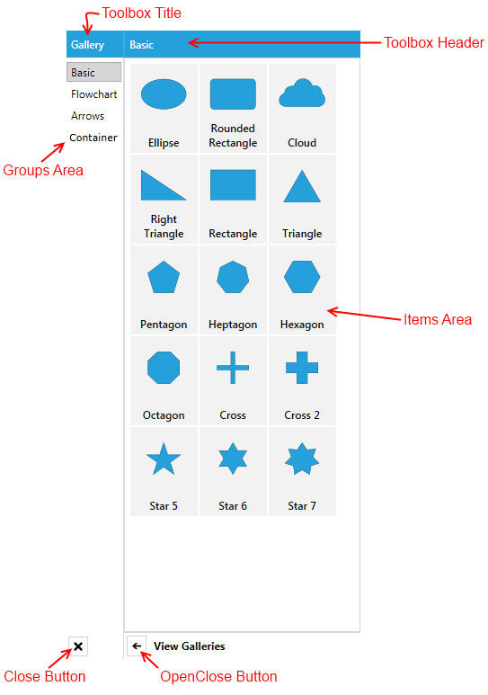
Visual Structure And Properties
The Diagram Extensions include a RadDiagramToolbox control. It is designed to display multiple galleries of RadDiagramShapes in a single control. Below you can see a snapshot and explanation of the main visual elements of the control.
The RadDiagramToolbox exposes the following list of properties:
Header - gets or sets an object that represents the RadDiagramToolbox header.
HeaderTemplate - gets or sets the DataTemplate used to display the header.
Title - gets or sets an object that represents the RadDiagramToolbox title.
TitleTemplate - gets or sets the DataTemplate used to display the title of the toolbox.
IsOpen - gets or sets a value that indicates whether the groups area of the RadDiagramToolbox control is visible.
CloseButtonStyle - gets or sets the style used by the Close button when it is rendered.
OpenCloseButtonStyle - gets or sets the style used by the OpenClose button when it is rendered.
Items - gets or sets the collection used to generate the content of the RadDiagramToolbox.
ItemsSource - gets or sets a business collection used to generate the content of the RadDiagramToolbox.
How to Use the Predefined HierarchicalGalleryItemsCollection
The Diagram Extensions provide a HierarchicalGalleryItemsCollection which is an ObservableCollection of galleries with predefined RadDiagramShapes. You can use it to populate the RadDiagramToolbox.ItemsSource collection with business items.
You can use it directly in XAML:
<Grid>
        <Grid.DataContext>
            <telerik:HierarchicalGalleryItemsCollection />
        </Grid.DataContext>
        <Grid.Resources>
            <telerik:BooleanToVisibilityConverter x:Key="BooleanToVisibilityConverter" />
            <!--  ToolboxItemTemplate  -->
                <DataTemplate x:Key="ToolboxItemTemplate">
                    <Grid Width="76"
                        Height="100"
                        Margin="0 1 1 0">
                        <Grid.RowDefinitions>
                            <RowDefinition Height="*" />
                            <RowDefinition Height="42" />
                        </Grid.RowDefinitions>
                        <Viewbox Margin="5 5 5 0"
                                HorizontalAlignment="Center"
                                VerticalAlignment="Bottom">
                            <ContentPresenter Margin="5"
                                            Content="{Binding Shape}"
                                            IsHitTestVisible="False" />
                        </Viewbox>
                        <TextBlock Grid.Row="1"
                                Margin="5"
                                HorizontalAlignment="Center"
                                VerticalAlignment="Top"
                                FontFamily="Segoe UI Semibold"
                                FontSize="12"
                                Text="{Binding Header}"
                                TextAlignment="Center"
                                TextWrapping="Wrap" />
                    </Grid>
                </DataTemplate>
                <!--  ToolboxGroupTemplate  -->
                <HierarchicalDataTemplate x:Key="ToolboxTemplate"
                                        ItemTemplate="{StaticResource ToolboxItemTemplate}"
                                        ItemsSource="{Binding Items}">
                    <TextBlock MinWidth="55" Text="{Binding Header}" />
                </HierarchicalDataTemplate>
        </Grid.Resources>
        <Grid.ColumnDefinitions>
        <ColumnDefinition Width="Auto" />
        <ColumnDefinition Width="*" />
        <ColumnDefinition Width="Auto" />


    </Grid.ColumnDefinitions>

    <telerik:RadDiagramToolbox x:Name="toolbox"
                            Title="Gallery"
                            Width="330"
                            HorizontalAlignment="Right"
                            Header="{Binding SelectedItem.Header,
                                                RelativeSource={RelativeSource Self}}"
                            ItemsSource="{Binding}"
                            ItemTemplate="{StaticResource ToolboxTemplate}"
                            Visibility="{Binding IsChecked,
                                                    ElementName=toolboxButton,
                                                    Converter={StaticResource BooleanToVisibilityConverter}}" />

</Grid>
or define a property of type HierarchicalGalleryItemsCollection in your ViewModel:
public class MainViewModel
{
    public HierarchicalGalleryItemsCollection GalleryItems { get; set; }

    public MainViewModel()
    {
        this.GalleryItems = new HierarchicalGalleryItemsCollection();
    }
}
Public Class MainViewModel
    Public Property GalleryItems() As HierarchicalGalleryItemsCollection
        Get
            Return _GalleryItems
        End Get
        Set
            _GalleryItems = Value
        End Set
    End Property
    Private _GalleryItems As HierarchicalGalleryItemsCollection

    Public Sub New()
        Me.GalleryItems = New HierarchicalGalleryItemsCollection()
    End Sub
End Class
<Grid>
    <Grid.DataContext>
         <!-- local is an alias pointing to your local namespace where the MainViewModel class is defined-->
        <local:MainViewModel />
    </Grid.DataContext>
    <Grid.Resources>
        <telerik:BooleanToVisibilityConverter x:Key="BooleanToVisibilityConverter" />
           <!--  ToolboxItemTemplate  -->
            <DataTemplate x:Key="ToolboxItemTemplate">
                <Grid Width="76"
                      Height="100"
                      Margin="0 1 1 0">
                    <Grid.RowDefinitions>
                        <RowDefinition Height="*" />
                        <RowDefinition Height="42" />
                    </Grid.RowDefinitions>
                    <Viewbox Margin="5 5 5 0"
                             HorizontalAlignment="Center"
                             VerticalAlignment="Bottom">
                        <ContentPresenter Margin="5"
                                          Content="{Binding Shape}"
                                          IsHitTestVisible="False" />
                    </Viewbox>
                    <TextBlock Grid.Row="1"
                               Margin="5"
                               HorizontalAlignment="Center"
                               VerticalAlignment="Top"
                               FontFamily="Segoe UI Semibold"
                               FontSize="12"
                               Text="{Binding Header}"
                               TextAlignment="Center"
                               TextWrapping="Wrap" />
                </Grid>
            </DataTemplate>
            <!--  ToolboxGroupTemplate  -->
            <HierarchicalDataTemplate x:Key="ToolboxTemplate"
                                      ItemTemplate="{StaticResource ToolboxItemTemplate}"
                                      ItemsSource="{Binding Items}">
                <TextBlock MinWidth="55" Text="{Binding Header}" />
            </HierarchicalDataTemplate>
    </Grid.Resources>


    <Grid.ColumnDefinitions>
        <ColumnDefinition Width="Auto" />
        <ColumnDefinition Width="*" />
        <ColumnDefinition Width="Auto" />

    </Grid.ColumnDefinitions>

    <telerik:RadDiagramToolbox x:Name="toolbox"
                               Title="Gallery"
                               Width="330"
                               HorizontalAlignment="Right"
                               Header="{Binding SelectedItem.Header,
                                                RelativeSource={RelativeSource Self}}"
                               ItemsSource="{Binding GalleryItems}"
                               ItemTemplate="{StaticResource ToolboxTemplate}"
                               Visibility="{Binding IsChecked,
                                                    ElementName=toolboxButton,
                                                    Converter={StaticResource BooleanToVisibilityConverter}}" />

</Grid>
Configure a RadDiagramToolbox to Display Part of the HierarchicalGalleryItemsCollection
The HierarchicalGalleryItemsCollection is populated based on the items in the Telerik.Windows.Controls.Diagrams.Extensions.GalleryItemsCollection grouped by the name of each gallery. This is why you can easily recreate it in your ViewModel:
public class MainViewModel
{
    public ObservableCollection<Gallery> GalleryItems { get; set; }

    public MainViewModel()
    {
        this.GalleryItems = new ObservableCollection<Gallery>();
        LoadData("Basic", "Flowchart", "Arrow", "Container");
    }

    private void LoadData(params string[] galleryNames)
    {
        var allItems = new GalleryItemsCollection();

        foreach (var galleryName in galleryNames)
        {
            var gallery = new Gallery { Header = galleryName };
            foreach (var item in allItems.GetItemsByType(galleryName).ToArray())
            {
                gallery.Items.Add(item);
            }
            this.GalleryItems.Add(gallery);
        }
    }
}
Public Class MainViewModel
    Public Property GalleryItems() As ObservableCollection(Of Gallery)
        Get
            Return _GalleryItems
        End Get
        Set
            _GalleryItems = Value
        End Set
    End Property
    Private _GalleryItems As ObservableCollection(Of Gallery)

    Public Sub New()
        Me.GalleryItems = New ObservableCollection(Of Gallery)()
        LoadData("Basic", "Flowchart", "Arrow","Container")
    End Sub

    Private Sub LoadData(ParamArray galleryNames As String())
        Dim allItems = New GalleryItemsCollection()

        For Each galleryName As var In galleryNames
            Dim gallery = New Gallery() With { .Header = galleryName }
            For Each item As var In allItems.GetItemsByType(galleryName).ToArray()
                gallery.Items.Add(item)
            Next
            Me.GalleryItems.Add(gallery)
        Next
    End Sub
End Class
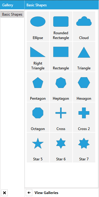
Next, you can customize your GalleryItems collection to display only the Basic Shapes gallery like so:
public class MainViewModel
{
    public ObservableCollection<Gallery> GalleryItems { get; set; }

    public MainViewModel()
    {
        this.GalleryItems = new ObservableCollection<Gallery>();
        LoadData("Basic");
    }

    private void LoadData(params string[] galleryNames)
    {
        var allItems = new GalleryItemsCollection();

        foreach (var galleryName in galleryNames)
        {
            var gallery = new Gallery { Header = galleryName };
            foreach (var item in allItems.GetItemsByType(galleryName).ToArray())
            {
                gallery.Items.Add(item);
            }
            this.GalleryItems.Add(gallery);
        }
    }
}
Public Class MainViewModel
    Public Property GalleryItems() As ObservableCollection(Of Gallery)
        Get
            Return _GalleryItems
        End Get
        Set
            _GalleryItems = Value
        End Set
    End Property
    Private _GalleryItems As ObservableCollection(Of Gallery)

    Public Sub New()
        Me.GalleryItems = New ObservableCollection(Of Gallery)()
        LoadData("Basic")
    End Sub

    Private Sub LoadData(ParamArray galleryNames As String())
        Dim allItems = New GalleryItemsCollection()

        For Each galleryName As var In galleryNames
            Dim gallery = New Gallery() With { .Header = galleryName}
            For Each item As var In allItems.GetItemsByType(galleryName).ToArray()
                gallery.Items.Add(item)
            Next
            Me.GalleryItems.Add(gallery)
        Next
    End Sub
End Class
How to Populate RadDiagramToolbox with Custom Data Items
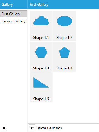
In case you need to populate a RadDiagramToolbox instance with a custom collection of business items, you will have to create a hierarchical collection of items. The first-level items of the collection should represent the galleries, whilst the second-level items should describe the shapes within the RadDiagramToolbox.
For the purpose of this tutorial we will create a class describing our shapes and a custom gallery class that defines a collection of shapes:
public class MyShape
{
    public Geometry Geometry { get; set; }
    public string Header { get; set; }
}
public class MyGallery
{
    public string Header { get; set; }
    public ObservableCollection<MyShape> Shapes { get; set; }
    public MyGallery()
    {
        this.Shapes = new ObservableCollection<MyShape>();
    }
}
public class MainViewModel
{
    public ObservableCollection<MyGallery> Items { get; set; }
    public MainViewModel()
    {
        this.Items = new ObservableCollection<MyGallery>();
        //create and populate the first custom gallery
        MyGallery firstGallery = new MyGallery { Header = "First Gallery" };
        firstGallery.Shapes.Add(new MyShape
        {
            Header = "Shape 1.1",
            Geometry = ShapeFactory.GetShapeGeometry(CommonShapeType.CloudShape)
        });
        firstGallery.Shapes.Add(new MyShape
        {
            Header = "Shape 1.2",
            Geometry = ShapeFactory.GetShapeGeometry(CommonShapeType.EllipseShape)
        });
        firstGallery.Shapes.Add(new MyShape
        {
            Header = "Shape 1.3",
            Geometry = ShapeFactory.GetShapeGeometry(CommonShapeType.HexagonShape)
        });
        firstGallery.Shapes.Add(new MyShape
        {
            Header = "Shape 1.4",
            Geometry = ShapeFactory.GetShapeGeometry(CommonShapeType.PentagonShape)
        });
        firstGallery.Shapes.Add(new MyShape
        {
            Header = "Shape 1.5",
            Geometry = ShapeFactory.GetShapeGeometry(CommonShapeType.RightTriangleShape)
        });
        this.Items.Add(firstGallery);

        //create and populate the second custom gallery
        MyGallery secondGallery = new MyGallery { Header = "Second Gallery" };
        secondGallery.Shapes.Add(new MyShape
        {
            Header = "Shape 2.1",
            Geometry = ShapeFactory.GetShapeGeometry(FlowChartShapeType.CardShape)
        });
        secondGallery.Shapes.Add(new MyShape
        {
            Header = "Shape 2.2",
            Geometry = ShapeFactory.GetShapeGeometry(FlowChartShapeType.Database1Shape)
        });
        secondGallery.Shapes.Add(new MyShape
        {
            Header = "Shape 2.3",
            Geometry = ShapeFactory.GetShapeGeometry(FlowChartShapeType.CollateShape)
        });
        secondGallery.Shapes.Add(new MyShape
        {
            Header = "Shape 2.4",
            Geometry = ShapeFactory.GetShapeGeometry(FlowChartShapeType.DataShape)
        });
        secondGallery.Shapes.Add(new MyShape
        {
            Header = "Shape 2.5",
            Geometry = ShapeFactory.GetShapeGeometry(FlowChartShapeType.DisplayShape)
        });
        this.Items.Add(secondGallery);
    }
}
Public Class MyShape
    Public Property Geometry() As Geometry
    Public Property Header() As String
End Class
Public Class MyGallery
    Public Property Header() As String
    Public Property Shapes() As ObservableCollection(Of MyShape)
    Public Sub New()
        Me.Shapes = New ObservableCollection(Of MyShape)()
    End Sub
End Class
Public Class MainViewModel
    Public Property Items() As ObservableCollection(Of MyGallery)
    Public Sub New()
        Me.Items = New ObservableCollection(Of MyGallery)()
        'create and populate the first custom gallery'
        Dim firstGallery As MyGallery = New MyGallery With {.Header = "First Gallery"}
        firstGallery.Shapes.Add(New MyShape With {.Header = "Shape 1.1", .Geometry = ShapeFactory.GetShapeGeometry(CommonShapeType.CloudShape)})
        firstGallery.Shapes.Add(New MyShape With {.Header = "Shape 1.2", .Geometry = ShapeFactory.GetShapeGeometry(CommonShapeType.EllipseShape)})
        firstGallery.Shapes.Add(New MyShape With {.Header = "Shape 1.3", .Geometry = ShapeFactory.GetShapeGeometry(CommonShapeType.HexagonShape)})
        firstGallery.Shapes.Add(New MyShape With {.Header = "Shape 1.4", .Geometry = ShapeFactory.GetShapeGeometry(CommonShapeType.PentagonShape)})
        firstGallery.Shapes.Add(New MyShape With {.Header = "Shape 1.5", .Geometry = ShapeFactory.GetShapeGeometry(CommonShapeType.RightTriangleShape)})
        Me.Items.Add(firstGallery)

        'create and populate the second custom gallery'
        Dim secondGallery As MyGallery = New MyGallery With {.Header = "Second Gallery"}
        secondGallery.Shapes.Add(New MyShape With {.Header = "Shape 2.1", .Geometry = ShapeFactory.GetShapeGeometry(FlowChartShapeType.CardShape)})
        secondGallery.Shapes.Add(New MyShape With {.Header = "Shape 2.2", .Geometry = ShapeFactory.GetShapeGeometry(FlowChartShapeType.Database1Shape)})
        secondGallery.Shapes.Add(New MyShape With {.Header = "Shape 2.3", .Geometry = ShapeFactory.GetShapeGeometry(FlowChartShapeType.CollateShape)})
        secondGallery.Shapes.Add(New MyShape With {.Header = "Shape 2.4", .Geometry = ShapeFactory.GetShapeGeometry(FlowChartShapeType.DataShape)})
        secondGallery.Shapes.Add(New MyShape With {.Header = "Shape 2.5", .Geometry = ShapeFactory.GetShapeGeometry(FlowChartShapeType.DisplayShape)})
        Me.Items.Add(secondGallery)
    End Sub
End Class
Once the ViewModels are all in place, you can use the MainViewModel as the DataContext of the RadDiagramToolbox and bind its ItemsSource to the Items collection. You will also need to define DataTemplates to visualize the MyShape and MyGallery items properly.
<Grid>
    <Grid.DataContext>
        <local:MainViewModel />
    </Grid.DataContext>
    <Grid.Resources>
        <telerik:BooleanToVisibilityConverter x:Key="BooleanToVisibilityConverter" />
        <!--  ToolboxItemTemplate  -->
        <DataTemplate x:Key="ToolboxItemTemplate">
            <Border Width="76"
                    Height="100"
                    Margin="0 1 1 0"
                    Background="Transparent">
                <Grid>
                    <Grid.RowDefinitions>
                        <RowDefinition Height="*" />
                        <RowDefinition Height="Auto" />
                    </Grid.RowDefinitions>
                    <Viewbox Width="64"
                             Height="50"
                             Margin="5 10 5 0"
                             HorizontalAlignment="Center"
                             VerticalAlignment="Top"
                             Stretch="Uniform">
                        <telerik:RadDiagramShape Margin="15"
                                                 VerticalAlignment="Top"
                                                 HorizontalContentAlignment="Center"
                                                 VerticalContentAlignment="Center"
                                                 Geometry="{Binding Geometry}"
                                                 IsHitTestVisible="False" />
                    </Viewbox>
                    <TextBlock Grid.Row="1"
                               Margin="0 0 0 5"
                               HorizontalAlignment="Center"
                               FontFamily="Segoe UI Semibold"
                               Padding="4 0"
                               Text="{Binding Header}"
                               TextAlignment="Center"
                               TextWrapping="Wrap" />
                </Grid>
            </Border>

        </DataTemplate>
        <!--  ToolboxGroupTemplate  -->
        <HierarchicalDataTemplate x:Key="ToolboxGroupTemplate"
                                  ItemsSource="{Binding Shapes}"
                                  ItemTemplate="{StaticResource ToolboxItemTemplate}">
            <TextBlock Text="{Binding Header}" />
        </HierarchicalDataTemplate>
    </Grid.Resources>

    <Grid.ColumnDefinitions>
        <ColumnDefinition Width="Auto" />
        <ColumnDefinition Width="*" />
        <ColumnDefinition Width="Auto" />

    </Grid.ColumnDefinitions>

    <telerik:RadDiagramToolbox x:Name="toolbox"
                               Title="Gallery"
                               Width="330"
                               HorizontalAlignment="Right"
                               Header="{Binding SelectedItem.Header,
                                                RelativeSource={RelativeSource Self}}"
                               ItemsSource="{Binding Items}"
                               ItemTemplate="{StaticResource ToolboxGroupTemplate}"
                               Visibility="{Binding IsChecked,
                                                    ElementName=toolboxButton,
                                                    Converter={StaticResource BooleanToVisibilityConverter}}" />

</Grid>
DragDrop Support
RadDiagramToolbox supports drag/drop operations out-of-the-box. As soon as a RadDiagramToolboxItem is initialized, it is made draggable through the DragDropManager AllowDrag and AllowCapturedDrag properties which are both set to true. Moreover, the Diagramming Framework internally handles the DragDropManager DragInitialize event to take from the dragged RadDiagramToolboxItem the shape it represents, if sush exists, and serialize its settings. The serialized settings are then saved in a DiagramDropInfo object along with the actual size of the dragged shape.
The DiagramDropInfo structure describes a dragged object within a RadDiagram instance. It includes a SerializationInfo property and a Size property – the first one holds the serialized settings of the dragged RadDiagramItem, while the second holds the actual size of the dragged item.
Due to this built-in DragDropManager drag implementation, you can easily drag shapes and containers out of a RadDiagramToolbox and drop them onto a diagramming surface. RadDiagram knows how to extract the serialized information out of a DiagramDropInfo object to create a new RadDiagramItem on the surface. However, if you create a custom RadDiagramToolbox populated with a business collection of items, you will have to further configure the drag/drop operation. Please have a look at the How To Drag Items from a Custom Databound DiagramToolbox tutorial for instructions on how to implement such a scenario.