Properties
This topic aims to get you familiar with the specific properties of each data bar type.
DataBinding
Value (a property of RadDataBar) - expects a value which will be used to determine the size of the bar.
ValuePath (a property of RadStackedDataBar and RadStacked100DataBar) - expects the name of the property from the underlying data item, which will determine the value of each bar in the stack.
RadDataBar
BarHeightPercent - specifies the height in percent for the bar to be displayed. For example a value of 0.5 will mean that the Bar will take 50% of the available space and there will be 25% available space on top and 25% on bottom.
LabelPosition - It's an enum with several options that you may choose from: Left, Right, EndOfBarInside or EndOfBarOutside. If LabelPosition is set to EndOfBarOutside/EndOfBarInside - the LabelDistance is the maximum distance in pixels between the bar and the textblock. If LabelPosition is set to Left/Right - LabelDistance is the margin of the text block.
LabelFormat - used to specify a label format expression custom numeric format string to customize the labels.
AxisVisibility - controls the visibility of the axis that marks the position origin value.
AxisStroke - sets stroke for the axis
LabelVisibility - controls whether the label should appear or not.
LabelStyle - for customization of the databar labels.
BorderBrush - provides a Brush to customize the border of the databar. Note that you'll also need to specify a BorderThickness.
ValueBrush and NegativeValueBrush - provides a Brush to customize the appearance of the positive and negative bars respectively.
ValueBorderBrush and NegativeValueBorderBrush - provides a Brush to customize the border of the positive and negative bars respectively.
ShowOutOfRangeIndicators - boolean property that controls the visibility of the out-of-range indicators. By default it's value is true. You can read more about it in our Overflow and UnderOverflow templates topic.
-
OriginValue - defines an origin for the databar to start at. For example:
Example 1: RadDataBar properties
     <telerik:RadDataBar Height="20" Value="50" BorderBrush="Gray" BorderThickness="1" Margin="2" />
     <telerik:RadDataBar Height="20" Value="50" OriginValue="30" BorderBrush="Gray" BorderThickness="1" Margin="2" />
     <telerik:RadDataBar Height="20" Value="60" OriginValue="30" BorderBrush="Gray" BorderThickness="1" Margin="2" />
     <telerik:RadDataBar Height="20" Value="120" OriginValue="30" BorderBrush="Gray" BorderThickness="1" Margin="2" />
     <telerik:RadDataBar Height="20" Value="20" OriginValue="30" BorderBrush="Gray" BorderThickness="1" Margin="2" />
     <telerik:RadDataBar Height="20" Value="10" OriginValue="30" BorderBrush="Gray" BorderThickness="1" Margin="2" />
     <telerik:RadDataBar Height="20" Value="-10" OriginValue="30" BorderBrush="Gray" BorderThickness="1" Margin="2" />
     <telerik:RadDataBar Height="20" Value="-100" OriginValue="30" BorderBrush="Gray" BorderThickness="1" Margin="2" />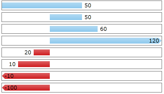
RadStackedDataBar and RadStacked100DataBar
-
BarBrushes - a Brush collection that is to be used with the bars.
The BrushCollection class is currently located in the Telerik.Windows.Controls.DataBars namespace so please mind adding a reference to it like so: "xmlns:dataBars="clr-namespace:Telerik.Windows.Controls.DataBars;assembly=Telerik.Windows.Controls.DataVisualization". Here's an example:
Example 2: RadStacked100DataBar BarBrushes property
     <telerik:RadStacked100DataBar.BarBrushes>
        <dataBars:BrushCollection>
            <SolidColorBrush Color="Red" />
            <SolidColorBrush Color="Green" />
            <SolidColorBrush Color="Blue" />
        </dataBars:BrushCollection>
     </telerik:RadStacked100DataBar.BarBrushes>
BarBorderBrushes - a Border Brush collection that is to be used with the bars.
ShowToolTips - controls the visibility of the tooltips.
ToolTipFormat - used to specify a format expression custom numeric format string to customize the tooltips.
AxisVisibility - controls the visibility of the axis that will appear at the start of the first bar
AxisStroke - sets stroke for the axis
ToolTipPath - sets the name of the property from the underlying data item, which will determine what to be displayed with the tooltip.
ValuePath - sets the name of the property from the underlying data item, which will determine what the value of the bar is.
ValueBrush and NegativeValueBrush - provides a Brush to customize the appearance of the positive and negative bars respectively.
ValueBorderBrush and NegativeValueBorderBrush - provides a Brush to customize the border of the positive and negative bars respectively.
RadHorizontalAxis
LabelStep - indicates that one out of n ticks should have a label where n is the value of the property.
MajorTickLength - controls the size of the major ticks.
Minimum and Maximum - the start and end value for the axis.
MinorTickLength - controls the size of the minor ticks.
Step - indicates the step of the ticks. For instance - if the minumum is "-20" and the maximum is "10" and the step is "3" - ticks will be visualized to indicate -20, -17, -14 .. 4, 7, 10.
Stroke - the stroke brush for the Axis
-
TicksDistance - specifies a value indicating that every axis tick should be placed at least n pixels away from the next one, where n is the value of the property. Use when you have too much data to display on the axis to control the number of ticks shown.
The TickDitance property has a smaller priority than Step. If both Step and TickDistance are set - the axis algorithm that distributes the ticks will only take into consideration the Step property. These two properties should not be used in conjunction.