Getting Started with WPF ContextMenu
This tutorial will walk you through the creation of a RadContextMenu and will show you how to:
Before reading this tutorial you should get familiar with the Visual Structure of the standard RadContextMenu control.
For the purpose of this tutorial, you will need to create an empty WPF Application project.
In order to use RadContextMenu control in your projects you have to add references to the following assemblies: 1. Telerik.Windows.Controls.Navigation.dll 2. Telerik.Windows.Controls.dll
Add RadContextMenu
In order to add a RadContextMenu control to your UserControl you have to declare the following namespace:
Example 1
xmlns:telerik="http://schemas.telerik.com/2008/xaml/presentation"
This tutorial will show you how to attach a RadContextMenu to a TextBox control. Here is the TextBox control definition.
Example 2
<Grid x:Name="LayoutRoot"
      Background="White">
    <TextBox x:Name="InputBox"
             Width="200"
             VerticalAlignment="Top">
    </TextBox>
</Grid>
The next step is to set the ContextMenu attached property of the RadContextMenu class to the TextBox control.
ContextMenu="{x:Null}" is needed to override the default context menu of the textbox.
Example 3
<Grid Background="White">
    <TextBox Width="200"
             VerticalAlignment="Top"
             ContextMenu="{x:Null}">
        <telerik:RadContextMenu.ContextMenu>
            <telerik:RadContextMenu />
        </telerik:RadContextMenu.ContextMenu>
    </TextBox>
</Grid>
If you run the application and right-click on the TextBox you will see an empty context menu.
Figure 1

Add Menu Items
The class that represents the menu item is Telerik.Windows.Controls.RadMenuItem. To learn more about it, please take a look at the RadMenu help content.
The RadContextMenu accepts RadMenuItems as child items. Here is a sample declaration of several child menu items.
Example 4
<TextBox Width="200"
         VerticalAlignment="Top"
         ContextMenu="{x:Null}">
    <telerik:RadContextMenu.ContextMenu>
        <telerik:RadContextMenu>
            <telerik:RadMenuItem Header="Copy" />
            <telerik:RadMenuItem Header="Paste" />
            <telerik:RadMenuItem Header="Cut" />
            <telerik:RadMenuItem IsSeparator="True" />
            <telerik:RadMenuItem Header="Select All" />
        </telerik:RadContextMenu>
    </telerik:RadContextMenu.ContextMenu>
</TextBox>
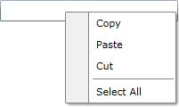
Here is a snapshot of the result.
Figure 2
Populating the RadContextMenu with Data
The scenario described in the previous sections covers the usage of static items. To learn more about these type of scenarios read here.
However, in most of the cases you have to bind your RadContextMenu to a collection of business objects. Check out the following topics which describe in details how to work with dynamic data.
Data Binding Support Overview - describes the various data sources for the RadContextMenu and shows you many tips and tricks. Read this topics in order to achieve basic knowledge about how the binding mechanism works at the RadContextMenu.
Binding to Dynamic Data - shows you how to bind the RadContextMenu to a collection of business objects.
Template and Styles Selectors - describes the possibilities to adjust the appearance of the RadContextMenu's items depending on the data they hold.
Styles and Templates
Read the Styles and Templates section which is entirely dedicated to styling and templating the RadContextMenu control.
Work with the RadContextMenu
In order to learn how to use the RadContextMenu and what capabilities it holds, read the various topics that describe its features.
Setting a Theme
The controls from our suite support different themes. You can see how to apply a theme different than the default one in the Setting a Theme help article.
Changing the theme using implicit styles will affect all controls that have styles defined in the merged resource dictionaries. This is applicable only for the controls in the scope in which the resources are merged.
To change the theme, you can follow the steps below:
Choose between the themes and add reference to the corresponding theme assembly (ex: Telerik.Windows.Themes.Windows8.dll). You can see the different themes applied in the Theming examples from our WPF Controls Examples application.
-
Merge the ResourceDictionaries with the namespace required for the controls that you are using from the theme assembly. For the RadContextMenu, you will need to merge the following resources:
- Telerik.Windows.Controls
- Telerik.Windows.Controls.Navigation
Example 5 demonstrates how to merge the ResourceDictionaries so that they are applied globally for the entire application.
Example 5: Merge the ResourceDictionaries
<Application.Resources>
    <ResourceDictionary>
        <ResourceDictionary.MergedDictionaries>
            <ResourceDictionary Source="/Telerik.Windows.Themes.Windows8;component/Themes/System.Windows.xaml"/>
            <ResourceDictionary Source="/Telerik.Windows.Themes.Windows8;component/Themes/Telerik.Windows.Controls.xaml"/>
            <ResourceDictionary Source="/Telerik.Windows.Themes.Windows8;component/Themes/Telerik.Windows.Controls.Navigation.xaml"/>
        </ResourceDictionary.MergedDictionaries>
    </ResourceDictionary>
</Application.Resources>
Alternatively, you can use the theme of the control via the StyleManager.
Figure 3 shows a RadContextMenu with the Windows8 theme applied.
Figure 3: RadContextMenu with the Windows8 theme
Telerik UI for WPF Learning Resources
- Telerik UI for WPF ContextMenu Component
- Getting Started with Telerik UI for WPF Components
- Telerik UI for WPF Installation
- Telerik UI for WPF and WinForms Integration
- Telerik UI for WPF Visual Studio Templates
- Setting a Theme with Telerik UI for WPF
- Telerik UI for WPF Virtual Classroom (Training Courses for Registered Users)
- Telerik UI for WPF License Agreement