Axes
The 3D space in the RadCartesianChart3D control is defined by three axes, one for each dimension – X, Y and Z. Currently, there are a couple of axis types that can be used with the 3D chart - LinearAxis3D and CategoricalAxis3D.
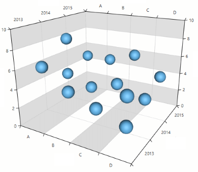
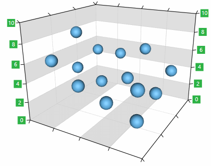
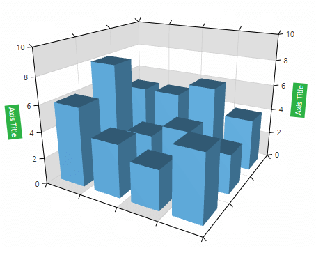
Figure 1: Axes
Common Features
The linear and categorical 3D axes share some common features which you can find listed below.
-
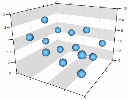
Labels visibility: You can control the visibility of the axis labels using the ShowLabels bool property.
Example 1: Setting the labels visibility
<telerik:LinearAxis3D ShowLabels="False"/>Figure 2: The labels of all axes are hidden
-
Label interval: You can set the interval between the visible labels of the axis using the LabelInterval property. This allows you to display labels only at a specific step.
Example 2: Setting the label interval
<telerik:LinearAxis3D LabelInterval="2" />Figure 3: Label interval
-
Label style: You can define a custom style for the axis labels using the LabelStyle property. The property accepts an object of type Style that targets a TextBlock element.
Example 3: Setting the label style
    <telerik:LinearAxis3D>
      <telerik:LinearAxis3D.LabelStyle>
         <Style TargetType="TextBlock">
                <Setter Property="Foreground" Value="#CA5100" />
               <Setter Property="FontWeight" Value="Bold" />
           </Style>
       </telerik:LinearAxis3D.LabelStyle>
    </telerik:LinearAxis3D>
Figure 4: Label style
-
Label template: You can create a DataTemplate that defines the appearance of the axis labels and set it to the LabelTemplate property of the axis.
Example 4: Setting the label template
    <telerik:LinearAxis3D>
        <telerik:LinearAxis3D.LabelTemplate>
            <DataTemplate>
                <Grid Margin="2">
                    <Rectangle Fill="#2DB245" Width="16" Height="16" />
                    <TextBlock Text="{Binding}" Foreground="White" TextAlignment="Center"/>
                </Grid>
            </DataTemplate>
        </telerik:LinearAxis3D.LabelTemplate>
    </telerik:LinearAxis3D>
Figure 5: Label template
The data context passed to the LabelTemplate is an object of type
System.Doublewhen the axis is LinearAxis3D. In case CategoricalAxis3D is used, the data context isSystem.Objectwhich contains the corresponding category provided by the series' items. -
Ticks length: You can define the length of the axis ticks using the MajorTickLength property.
Example 5: Setting the label template
<telerik:LinearAxis3D MajorTickLength="15">Figure 6: Tick length
-
Plot mode: You can set the strategy for positioning the data points along the axis using the PlotMode property of the axis.
Example 6: Setting the plot mode
<telerik:CategoricalAxis3D PlotMode="BetweenTicks">The PlotMode property can have the following values:
-
BetweenTicks: The data points are plotted between each two adjacent ticks.
-
OnTicks: The data points are plotted over each tick.
- OnTicksPadded: The data points are plotted over each tick with half a step applied on both ends of the axis.
Figure 7: Plot modes
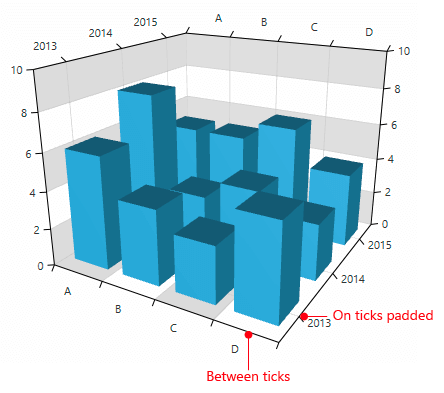
-
BetweenTicks: The data points are plotted between each two adjacent ticks.
-
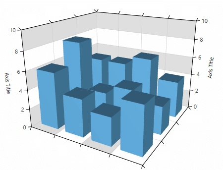
Title: The Title property allows you to display a heading positioned next to the axis. To customize the title appearance you can use the TitleTemplate property.
Example 7: Setting the axis title
<telerik:CategoricalAxis3D Title=”Axis title">Figure 8: Axis title
Example 8: Setting the axis title template
    <telerik:LinearAxis3D Title="Axis title">
        <telerik:LinearAxis3D.TitleTemplate>
            <DataTemplate>
                <TextBlock Text="{Binding}" Background="#2DB245" Foreground="White" Padding="3"  />
            </DataTemplate>
        </telerik:CategoricalAxis3D.TitleTemplate>
    </telerik:CategoricalAxis3D>
Figure 9: Axis title template
-
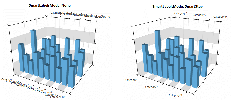
Smart labels: You can avoid labels overlapping with the smart labels strategy of the axis. To enable this feature you can use the SmartLabelsMode property.
Example 9: Enabling the axis smart labels
<telerik:CategoricalAxis3D SmartLabelsMode="SmartStep">Figure 0: Smart labels mode
-
Line style: You can modify the appearance of the lines drawn for the axes by creating a style which targets the Path type and set it as the LineStyle property of the axis.
Example 10: Enabling the axis smart labels
    <telerik:LinearAxis3D>
        <telerik:LinearAxis3D.LineStyle>
            <Style TargetType="Path">
                <Setter Property="Stroke" Value="Red" />
                <Setter Property="StrokeThickness" Value="3" />
            </Style>
        </telerik:LinearAxis3D.LineStyle>
    </telerik:LinearAxis3D>
Figure 11: Styled lines of the Z axis
LinearAxis3D
This type of axis has a notion of range which means that it has minimum, maximum and a numeric step between its values. The axis can be used to plot numeric data. You can find the axis specific features listed below.
-
Desired tick count: You can use the DesiredTickCount property of the axis to set the number of the desired ticks that will be displayed on the axis. Note that the property doesn’t set a fixed number of ticks, but it defines the preferred count and the chart tries to calculate them accordingly.
Example 11: Setting the desired tick count
<telerik:LinearAxis3D DesiredTickCount="3" /> -
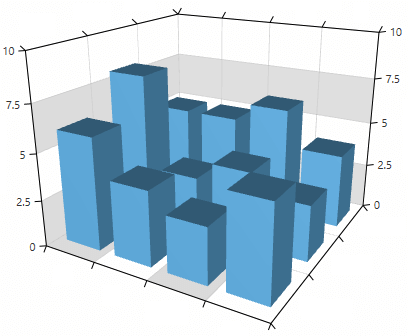
Manual range: You can use the Minimum and Maximum properties of the axis to set the range manually. To control the step between the ticks you can use the MajorStep property.
Example 12: Setting manual range
<telerik:LinearAxis3D Minimum=”0” Maximum=”10” MajorStep="2.5" />Figure 2: Manual range
-
Tick origin: The axis tick positions are determined by the MajorStep and the TickOrigin properties. The ticks will be generated such that a tick is positioned at the given TickOrigin.
Example 13: Setting the axis tick origin
<telerik:LinearAxis3D Minimum="0" Maximum="10" MajorStep="2.5" TickOrigin="5"/>Figure 3: Tick origin
-
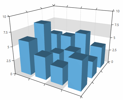
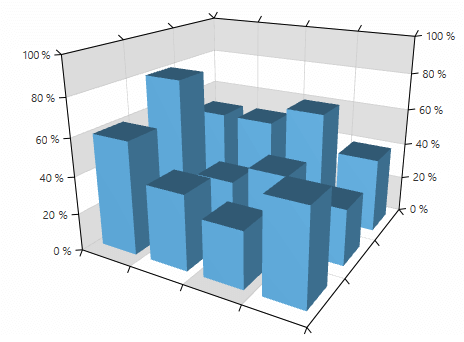
Label format: You can use the LabelFormat property to format the values of the axis labels.
Example 14: Setting the axis label format
<telerik:LinearAxis3D LabelFormat="P0"/>Figure 4: Label format
-
Actual range: Use the ActualRange property of LinearAxis3D to get the actual data range of the axis (auto-generated or coming from the Minimum and Maximum properties).
Example 15: Get the actual range of the axis
ValueRange<double> actualRange = this.linearAxis3D.ActualRange;When the range changes, the ActualRangeChanged event fires.
Example 16: ActualRangeChanged event handler
    private void LinearAxis3D_ActualRangeChanged(object sender, Telerik.Charting.NumericalRangeChangedEventArgs e)
    {
        ValueRange<double> oldRange = e.PreviousRange;
        ValueRange<double> newRange = e.NewRange;
    }