Getting Started with WPF AutoCompleteBox
This tutorial will walk you through the creation of a sample application that contains RadAutoCompleteBox.
- Assembly References
- Add RadAutoCompleteBox to the Project
- Populate with Data
- Customize the Control
- Setting a Theme
Assembly References
In order to use RadAutoCompleteBox in your project you have to add a reference to the following assemblies:
- Telerik.Windows.Controls
- Telerik.Windows.Controls.Input
Add RadAutoCompleteBox to the Project
You can include the control in your projects by either dragging it from the toolbox in Visual Studio and Blend or by manually creating the control.
The following examples show how to create a RadAutoCompleteBox control in the code-behind and in XAML:
Example 1: Creating a RadAutoCompleteBox in code-behind
RadAutoCompleteBox autoCompleteBox = new RadAutoCompleteBox();
Dim autoCompleteBox As New RadAutoCompleteBox()
Example 1: Creating a RadAutoCompleteBox in XAML
<UserControl xmlns:telerik="http://schemas.telerik.com/2008/xaml/presentation">
    <Grid x:Name="LayoutRoot" Background="White">
        <telerik:RadAutoCompleteBox x:Name="radAutoCompleteBox"/>
    </Grid>
</UserControl>
Populate with Data
In order to populate the RadAutoCompleteBox with data, you can set its ItemsSource property to any IEnumerable collection of items.
Example 2: Set RadAutoCompleteBox's ItemsSource
public MainWindow()
{
    InitializeComponent();
    var countries = new ObservableCollection<Country>()
    {
        new Country() { Name = "Australia", Capital = "Canberra" },
        new Country() { Name = "Bulgaria", Capital = "Sofia" },
        new Country() { Name = "Canada", Capital = "Ottawa" },
        new Country() { Name = "Denmark", Capital = "Copenhagen" },
        new Country() { Name = "France", Capital = "Paris" },
        new Country() { Name = "Germany", Capital = "Berlin" },
        new Country() { Name = "India", Capital = "New Delhi" },
        new Country() { Name = "Italy", Capital = "Rome" },
        new Country() { Name = "Norway", Capital = "Oslo" },
        new Country() { Name = "Russia", Capital = "Moscow" },
        new Country() { Name = "Spain ", Capital = "Madrid" },
        new Country() { Name = "United Kingdom", Capital = "London" },
        new Country() { Name = "United States", Capital = "Washington, D.C." },
    };

    this.AutoComplete.ItemsSource = countries;
}
Customize the Control
To actually display results when using the ObservableCollection from Example 2 you have to specify the DisplayMemberPath which specifies the name or path of the property that is displayed for each data item.
You can then set the control's abundance of properties to customize it per your needs.
Example 3: Customize the RadAutoCompleteBox
<telerik:RadAutoCompleteBox x:Name="autoComplete"
                                AutoCompleteMode="Suggest"
                                DisplayMemberPath="Name"
                                TextSearchPath="Capital"
                                TextSearchMode="Contains"
                                WatermarkContent="Select a country..." />
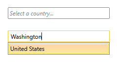
Figure 1 illustrates the result from the code in Example 3.
Figure 1: Customized RadAutoCompleteBox
Set a Theme
The controls from our suite support different themes. You can see how to apply a theme different than the default one in the Setting a Theme help article.
Changing the theme using implicit styles will affect all controls that have styles defined in the merged resource dictionaries. This is applicable only for the controls in the scope in which the resources are merged.
To change the theme, you can follow the steps below:
Choose between the themes and add reference to the corresponding theme assembly (ex: Telerik.Windows.Themes.Office2016.dll). You can see the different themes applied in the Theming examples from our WPF Controls Examples application.
-
Merge the ResourceDictionaries with the namespace required for the controls that you are using from the theme assembly. For the RadAutoCompleteBox, you will need to merge the following resources:
- Telerik.Windows.Controls
- Telerik.Windows.Controls.Input
Example 4 demonstrates how to merge the ResourceDictionaries so that they are applied globally for the entire application.
Example 4: Merge the ResourceDictionaries
<Application.Resources>
    <ResourceDictionary>
        <ResourceDictionary.MergedDictionaries>
            <ResourceDictionary Source="/Telerik.Windows.Themes.Office2016;component/Themes/System.Windows.xaml"/>
            <ResourceDictionary Source="/Telerik.Windows.Themes.Office2016;component/Themes/Telerik.Windows.Controls.xaml"/>
            <ResourceDictionary Source="/Telerik.Windows.Themes.Office2016;component/Themes/Telerik.Windows.Controls.Input.xaml"/>
        </ResourceDictionary.MergedDictionaries>
    </ResourceDictionary>
</Application.Resources>
Alternatively, you can use the theme of the control via the StyleManager.
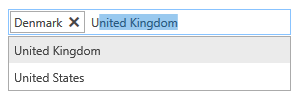
Figure 2 shows a RadAutoCompleteBox with the Office2016 theme applied.
Figure 2: RadAutoCompleteBox with the Office2016 theme
Telerik UI for WPF Learning Resources
- Telerik UI for WPF AutoCompleteBox Component
- Getting Started with Telerik UI for WPF Components
- Telerik UI for WPF Installation
- Telerik UI for WPF and WinForms Integration
- Telerik UI for WPF Visual Studio Templates
- Setting a Theme with Telerik UI for WPF
- Telerik UI for WPF Virtual Classroom (Training Courses for Registered Users)
- Telerik UI for WPF License Agreement