Header Styling Options
This article describes how the header can be manipulated to change the overall appearance of the control by using the styling properties.
Introduction To Styling
The most important RadGroupBox layout styling options include the following:
GroupBoxStyle: There are two defined styles, Standard and Office. The styles are defined in RadGroupBoxStyle enumeration.
HeaderAlignment: Header alignment options are defined in HeaderAlignment enumeration, Near, Center, and Far.
HeaderPosition: Header position options are defined in HeaderPosition enumeration, Top, Left, Bottom, and Right.
HeaderMargin: Defines the header margin.
FooterVisibility: Defines the footer visibility. Its default value is Collapsed.
The most important Header and Footer styling options include the following ones:
HeaderImage
FooterImage
HeaderImageAlignment
FooterImageAlignment
HeaderText
FooterText
HeaderTextAlignment
FooterTextAlignment
HeaderTextImageRelation
FooterTextImageRelation
Please refer to ImageAndTextLayoutPanel documentation section about further details of those properties.
All these properties can be set in Visual Style Builder. Furthermore, the control can be customized on a very fine-grained level using the Visual Style Builder to set any other property in the control hierarchy. Please refer to Structure section for more details.
Header Position
The HeaderPosition can be set to Top, Right, Bottom, and Left: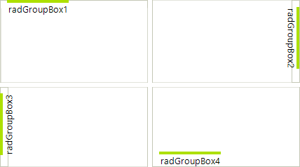
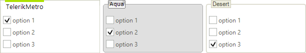
Header Alignment
HeaderAlignment takes Near, Center, and *Far *values:
HeaderAlignment is not taken into consideration when the GroupBoxStyle is set to Office. In this case the header occupies the whole width or height of the control. You may use HeaderTextAlignment and HeaderImageAlignment properties in this case.
Group Box Style
There are two styles - Standard *and *Office:
Footer Visibility
Footer can be Visible, Collapsed, and Hidden: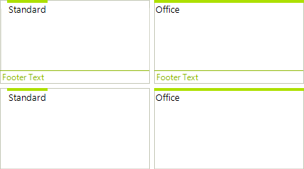
Note: The default value is Collapsed.
Header and Footer Images
The text and image relation can be set with the familiar properties: HeaderImageAndTextRelation, HeaderImageAlignment, and HeaderTextAlignment: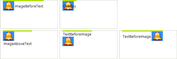
There are corresponding footer properties.