Accessing and Customizing Elements
Accessing and customizing elements can be performed either at design time, or at run time. Before proceeding with this topic, it is recommended to get familiar with the visual structure of the RadGroupBox.
Design time
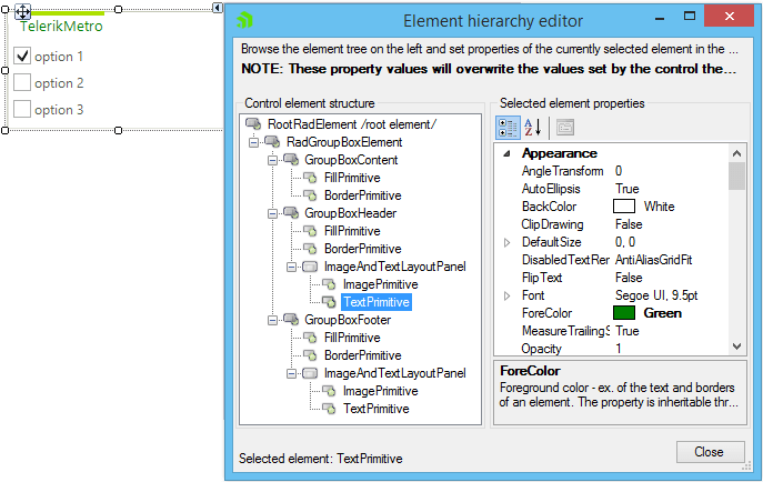
You can access and modify the style for different elements in RadGroupBox by using the Element hierarchy editor. It can be accessed by selecting the Edit UI Elements item from the Smart Tag.
Figure 1: Element Hierarchy Editor

Programmatically
You can customize the nested elements at run time as well:
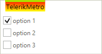
Figure 2: Customize elements

The code sample below access the FillPrimitive of the header, changes the first two gradient stop colors to red and yellow, and then the gradient style to linear. GroupBoxElement property of the control returns the RadGroupBoxElement, then the code access the GroupBoxHeader - Children[1] - finally the code access the FillPrimitive - Children[0] - which is cast to FillPrimitive so that you can use its properties like GradientStyle.
Change the GroupBox Header Color
FillPrimitive fill = ((FillPrimitive)this.radGroupBox1.GroupBoxElement.Children[1].Children[0]);
fill.ShouldPaint = true;
fill.BackColor = Color.Red;
fill.BackColor2 = Color.Yellow;
fill.GradientStyle = Telerik.WinControls.GradientStyles.Linear;
Dim fill As FillPrimitive = DirectCast(Me.RadGroupBox1.GroupBoxElement.Children(1).Children(0), FillPrimitive)
fill.ShouldPaint = True
fill.BackColor = Color.Red
fill.BackColor2 = Color.Yellow
fill.GradientStyle = Telerik.WinControls.GradientStyles.Linear
The code samples below are just a demonstration of how you can set node properties programmatically. You will probably prefer to use the Visual Style Builder to create your themes using no code.