Styling the Expander
If you need to change only the icon that is used to expand an item, you can use the ExpanderStyle property of the RadTreeView. The icon is a ToggleButton, so any style that can be applied to a ToggleButton can be applied to the icon too.
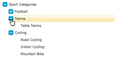
This tutorial will walk you through the common task of styling an expander.
On the snapshot below you can see how the final result will look like:
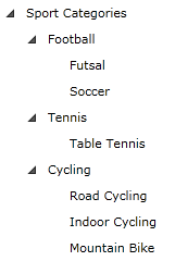
For the purpose of the following tutorial I will use the following treeview declaration:
<telerik:RadTreeView Margin="8" x:Name="radTreeView">
    <telerik:RadTreeViewItem Header="Sport Categories">
        <telerik:RadTreeViewItem Header="Football">
            <telerik:RadTreeViewItem Header="Futsal"/>
            <telerik:RadTreeViewItem Header="Soccer"/>
        </telerik:RadTreeViewItem>
        <telerik:RadTreeViewItem Header="Tennis">
            <telerik:RadTreeViewItem Header="Table Tennis"/>
        </telerik:RadTreeViewItem>
        <telerik:RadTreeViewItem Header="Cycling">
            <telerik:RadTreeViewItem Header="Road Cycling"/>
            <telerik:RadTreeViewItem Header="Indoor Cycling"/>
            <telerik:RadTreeViewItem Header="Mountain Bike"/>
        </telerik:RadTreeViewItem>
    </telerik:RadTreeViewItem>
</telerik:RadTreeView>
-
Since the expander is a toggle button we need to create a style with TargetType - ToggleButton.
Declare a new style in your application (user control) resources and set the following common properties:
- Set the IsEnabled property to True;
- Set the IsTabStop property to False;
- Change the cursor to be Hand
<Style x:Key="ExpanderStyle" TargetType="ToggleButton"> <Setter Property="IsEnabled" Value="True" /> <Setter Property="IsTabStop" Value="False" /> <Setter Property="Cursor" Value="Hand"/> </Style> -
Next, we need to change the Template property of the ToggleButton (Expander). Add the following elements to your Template:
<Style x:Key="ExpanderStyle" TargetType="ToggleButton"> <Setter Property="IsEnabled" Value="True" /> <Setter Property="IsTabStop" Value="False" /> <Setter Property="Cursor" Value="Hand"/> <Setter Property="Template"> <Setter.Value> <ControlTemplate TargetType="ToggleButton"> <Grid x:Name="Button" Margin="0,4,0,0" HorizontalAlignment="Right" VerticalAlignment="Top" Width="16" Height="16"> <Rectangle Stroke="#FF027BA6" HorizontalAlignment="Stretch" VerticalAlignment="Stretch" Width="Auto" Height="Auto" RadiusX="3" RadiusY="3" Fill="#FF00A2DC"> </Rectangle> <Rectangle x:Name="CollapsedVisual" HorizontalAlignment="Left" VerticalAlignment="Top" Width="2" Height="8" RadiusX="0" RadiusY="0" Fill="#FFFFFFFF" Margin="7,4,0,0" /> <Rectangle RadiusX="0" RadiusY="0" Fill="#FFFFFFFF" HorizontalAlignment="Left" Margin="4,7,0,0" VerticalAlignment="Top" Width="8" Height="2" /> </Grid> </ControlTemplate> </Setter.Value> </Setter> </Style> -
Set the ExpanderStyle property of your treeview:
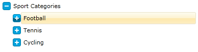
    <telerik:RadTreeView Margin="8" x:Name="radTreeView"
        ExpanderStyle="{StaticResource ExpanderStyle}">
        <telerik:RadTreeViewItem Header="Sport Categories">
            <telerik:RadTreeViewItem Header="Football">
                <telerik:RadTreeViewItem Header="Futsal"/>
                <telerik:RadTreeViewItem Header="Soccer"/>
            </telerik:RadTreeViewItem>
            <telerik:RadTreeViewItem Header="Tennis">
                <telerik:RadTreeViewItem Header="Table Tennis"/>
            </telerik:RadTreeViewItem>
            <telerik:RadTreeViewItem Header="Cycling">
                <telerik:RadTreeViewItem Header="Road Cycling"/>
                <telerik:RadTreeViewItem Header="Indoor Cycling"/>
                <telerik:RadTreeViewItem Header="Mountain Bike"/>
            </telerik:RadTreeViewItem>
        </telerik:RadTreeViewItem>
    </telerik:RadTreeView>
As you can see from the next figure, the expander of the treeview is changed:
-
We are one more step closer to the final result. Next we should add some visual effects. For that purpose add the following elements to your expander template:
    <Style x:Key="ExpanderStyle" TargetType="ToggleButton">
        <Setter Property="IsEnabled" Value="True" />
        <Setter Property="IsTabStop" Value="False" />
        <Setter Property="Cursor" Value="Hand"/>
        <Setter Property="Template">
            <Setter.Value>
                <ControlTemplate TargetType="ToggleButton">
                    <Grid>
                        <Grid x:Name="ButtonOver" Opacity="0" Margin="0,4,0,0"
                                   HorizontalAlignment="Right" VerticalAlignment="Top"
                                   Width="16" Height="16">
                            <Rectangle Stroke="#FF027BA6" HorizontalAlignment="Stretch"
                                       VerticalAlignment="Stretch" Width="Auto" Height="Auto"
                                       RadiusX="3" RadiusY="3">
                                <Rectangle.Fill>
                                    <LinearGradientBrush EndPoint="0.5,1" StartPoint="0.5,0">
                                        <GradientStop Color="#FF00BCFF" Offset="0" />
                                        <GradientStop Color="#FF027BA6" Offset="1" />
                                        <GradientStop Color="#FF00A5E0" Offset="0.5" />
                                        <GradientStop Color="#FF005674" Offset="0.501" />
                                    </LinearGradientBrush>
                                </Rectangle.Fill>
                            </Rectangle>
                            <Rectangle x:Name="CollapsedVisualOver"
                                       HorizontalAlignment="Left" VerticalAlignment="Top"
                                       Width="2" Height="8" RadiusX="0" RadiusY="0"
                                       Fill="#FFFFFFFF" Margin="7,4,0,0" />
                            <Rectangle RadiusX="0" RadiusY="0" Fill="#FFFFFFFF"
                                       HorizontalAlignment="Left" VerticalAlignment="Top"
                                       Width="8" Height="2" Margin="4,7,0,0" />
                        </Grid>
                        <Grid x:Name="Button" Margin="0,4,0,0" HorizontalAlignment="Right"
                           VerticalAlignment="Top" Width="16" Height="16">
                            <Rectangle Stroke="#FF027BA6" HorizontalAlignment="Stretch"
                               VerticalAlignment="Stretch" Width="Auto" Height="Auto"
                               RadiusX="3" RadiusY="3" Fill="#FF00A2DC">
                            </Rectangle>
                            <Rectangle x:Name="CollapsedVisual" HorizontalAlignment="Left"
                               VerticalAlignment="Top" Width="2" Height="8" RadiusX="0"
                               RadiusY="0" Fill="#FFFFFFFF" Margin="7,4,0,0" />
                            <Rectangle RadiusX="0" RadiusY="0" Fill="#FFFFFFFF"
                               HorizontalAlignment="Left" Margin="4,7,0,0"
                               VerticalAlignment="Top" Width="8" Height="2" />
                        </Grid>
                    </Grid>
                </ControlTemplate>
            </Setter.Value>
        </Setter>
    </Style>
The __ButtonOver__grid will be animated when the mouse is position over the expander.
Open your application in Expression Blend. Find the "ExpanderStyle" in the Resources pane and press the "Edit resource" button:
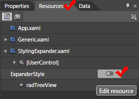
-
Right click on the __Style__object in the __Objects and Timeline__pane and select Edit Template->Edit Current...
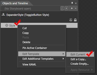
The ToggleButton template will be opened for edit.
-
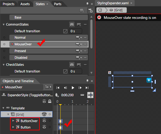
Using the Visual State Manager, add the following visual states:
-
MouseOver - set the key time to 2 seconds and set the following properties:
- Set the Button's Opacity to 0
- Set the ButtonOver's Opacity to 1 (100%)
-
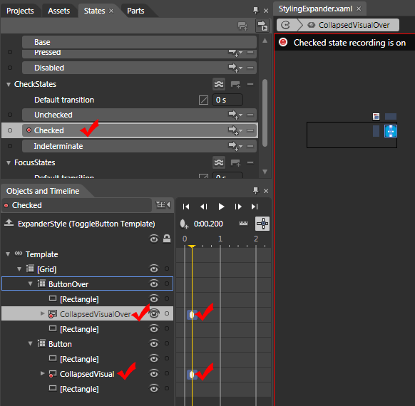
Checked - set the key time to 2 seconds and set the following properties:
- Set the CollapseVisual's Opacity to 0
- Set the CollapseVisualOver's Opacity to 0
-
Unchecked - set the key time to 2 seconds and set the following properties:
- Set the CollapseVisual's Opacity to 1 (100%)
- Set the CollapseVisualOver's Opacity to 1 (100%)
-
Here is the result XAML:
<Style x:Key="ExpanderStyle" TargetType="ToggleButton">
    <Setter Property="IsEnabled" Value="True" />
    <Setter Property="IsTabStop" Value="False" />
    <Setter Property="Cursor" Value="Hand"/>
    <Setter Property="Template">
        <Setter.Value>
            <ControlTemplate TargetType="ToggleButton">
                <Grid>
              <VisualStateManager.VisualStateGroups>
               <VisualStateGroup x:Name="CommonStates">
                <VisualState x:Name="Normal"/>
                <VisualState x:Name="MouseOver">
                 <Storyboard>
                  <DoubleAnimationUsingKeyFrames BeginTime="00:00:00" Storyboard.TargetName="ButtonOver" Storyboard.TargetProperty="(UIElement.Opacity)">
                   <EasingDoubleKeyFrame KeyTime="00:00:00.2000000" Value="1"/>
                  </DoubleAnimationUsingKeyFrames>
                  <DoubleAnimationUsingKeyFrames BeginTime="00:00:00" Storyboard.TargetName="Button" Storyboard.TargetProperty="(UIElement.Opacity)">
                   <EasingDoubleKeyFrame KeyTime="00:00:00.2000000" Value="0"/>
                  </DoubleAnimationUsingKeyFrames>
                 </Storyboard>
                </VisualState>
               </VisualStateGroup>
               <VisualStateGroup x:Name="CheckStates">
                <VisualState x:Name="Unchecked">
                 <Storyboard>
                  <DoubleAnimationUsingKeyFrames BeginTime="00:00:00" Storyboard.TargetName="CollapsedVisual" Storyboard.TargetProperty="(UIElement.Opacity)">
                   <EasingDoubleKeyFrame KeyTime="00:00:00.2000000" Value="1"/>
                  </DoubleAnimationUsingKeyFrames>
                  <DoubleAnimationUsingKeyFrames BeginTime="00:00:00" Storyboard.TargetName="CollapsedVisualOver" Storyboard.TargetProperty="(UIElement.Opacity)">
                   <EasingDoubleKeyFrame KeyTime="00:00:00.2000000" Value="1"/>
                  </DoubleAnimationUsingKeyFrames>
                 </Storyboard>
                </VisualState>
                <VisualState x:Name="Checked">
                 <Storyboard>
                  <DoubleAnimationUsingKeyFrames BeginTime="00:00:00" Storyboard.TargetName="CollapsedVisualOver" Storyboard.TargetProperty="(UIElement.Opacity)">
                   <EasingDoubleKeyFrame KeyTime="00:00:00.2000000" Value="0"/>
                  </DoubleAnimationUsingKeyFrames>
                  <DoubleAnimationUsingKeyFrames BeginTime="00:00:00" Storyboard.TargetName="CollapsedVisual" Storyboard.TargetProperty="(UIElement.Opacity)">
                   <EasingDoubleKeyFrame KeyTime="00:00:00.2000000" Value="0"/>
                  </DoubleAnimationUsingKeyFrames>
                 </Storyboard>
                </VisualState>
               </VisualStateGroup>
              </VisualStateManager.VisualStateGroups>
              <Grid x:Name="ButtonOver" Opacity="0" Margin="0,4,0,0"
               HorizontalAlignment="Right" VerticalAlignment="Top"
               Width="16" Height="16">
               <Rectangle Stroke="#FF027BA6" HorizontalAlignment="Stretch"
                VerticalAlignment="Stretch" Width="Auto" Height="Auto"
                RadiusX="3" RadiusY="3">
                <Rectangle.Fill>
                 <LinearGradientBrush EndPoint="0.5,1" StartPoint="0.5,0">
                  <GradientStop Color="#FF00BCFF" Offset="0" />
                  <GradientStop Color="#FF027BA6" Offset="1" />
                  <GradientStop Color="#FF00A5E0" Offset="0.5" />
                  <GradientStop Color="#FF005674" Offset="0.501" />
                 </LinearGradientBrush>
                </Rectangle.Fill>
               </Rectangle>
               <Rectangle x:Name="CollapsedVisualOver"
                HorizontalAlignment="Left" VerticalAlignment="Top"
                Width="2" Height="8" RadiusX="0" RadiusY="0"
                Fill="#FFFFFFFF" Margin="7,4,0,0" />
               <Rectangle RadiusX="0" RadiusY="0" Fill="#FFFFFFFF"
                HorizontalAlignment="Left" VerticalAlignment="Top"
                Width="8" Height="2" Margin="4,7,0,0" />
              </Grid>
              <Grid x:Name="Button" Margin="0,4,0,0" HorizontalAlignment="Right"
               VerticalAlignment="Top" Width="16" Height="16">
               <Rectangle Stroke="#FF027BA6" HorizontalAlignment="Stretch"
                VerticalAlignment="Stretch" Width="Auto" Height="Auto"
                RadiusX="3" RadiusY="3" Fill="#FF00A2DC"/>
               <Rectangle x:Name="CollapsedVisual" HorizontalAlignment="Left"
                VerticalAlignment="Top" Width="2" Height="8" RadiusX="0"
                RadiusY="0" Fill="#FFFFFFFF" Margin="7,4,0,0" />
               <Rectangle RadiusX="0" RadiusY="0" Fill="#FFFFFFFF"
                HorizontalAlignment="Left" Margin="4,7,0,0"
                VerticalAlignment="Top" Width="8" Height="2" />
              </Grid>
             </Grid>
            </ControlTemplate>
        </Setter.Value>
    </Setter>
</Style>
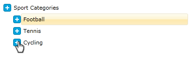
Here is the result: