Theming
Telerik themes are not turned on by default in RadToolTip. This article describes two approaches which can be used to theme the RadToolTip control.
The first approach that can be used for setting up the RadToolTip theming is to set the RadToolTipContentView control inside the ToolTipContent property.
Example 2: Setting ToolTipContent property
<Ellipse Width="80" Height="80" Fill="#FF1B9DDE" Stroke="#FF1B9DDE" StrokeThickness="2"
       telerik:RadToolTipService.Placement="Top"
       telerik:RadToolTipService.VerticalOffset="-10">
    <telerik:RadToolTipService.ToolTipContent>
        <telerik:RadToolTipContentView>
            <TextBlock Text="RadToolTip" />
        </telerik:RadToolTipContentView>
    </telerik:RadToolTipService.ToolTipContent>
</Ellipse>
The second approach to use predefined Telerik styles is to define a ContentTemplate for the RadToolTip component and use the RadToolTipContentView control inside the template. The following code example demonstrates how to set up RadToolTip to use the Telerik themes.
Example 1: Setting ToolTipContentTemplate property
<Ellipse Width="80" Height="80" Fill="#FF1B9DDE" Stroke="#FF1B9DDE" StrokeThickness="2"
          telerik:RadToolTipService.Placement="Top"
          telerik:RadToolTipService.VerticalOffset="-10"
          telerik:RadToolTipService.ToolTipContent="RadToolTip">
    <telerik:RadToolTipService.ToolTipContentTemplate>
        <DataTemplate>
            <telerik:RadToolTipContentView>
                <TextBlock Text="{Binding}" />
            </telerik:RadToolTipContentView>
        </DataTemplate>
    </telerik:RadToolTipService.ToolTipContentTemplate>
</Ellipse>
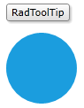
The end result is demonstrated in the picture below: