Key Properties
RadTabControl is an advanced control that allows you to control its behavior in order to achieve maximum UX satisfaction.
In this chapter we will show you some of the ways you can use to customize the control behavior.
Reorder Tab Rows
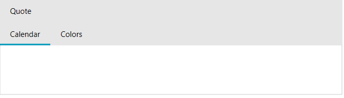
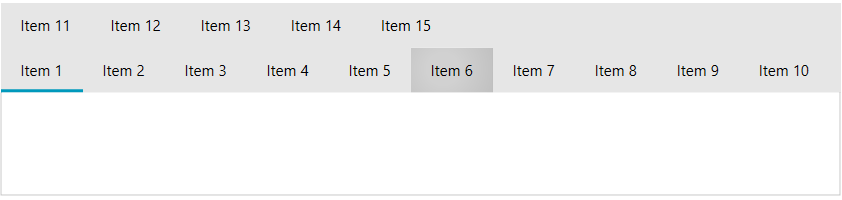
Using the ReorderTabRows property you can control how the tab item rows are ordered in case of multiple lines. The default behavior is to keep the selected tab item always on the lowest row and move the other rows above.
The default value for the ReorderTabRows property is True.
ReorderTabRows
<telerik:RadTabControl x:Name="radTabControl" ReorderTabRows="True">
    <telerik:RadTabItem Header="Calendar"/>
    <telerik:RadTabItem Header="Colors" IsBreak="True"/>
    <telerik:RadTabItem Header="Quote"/>
</telerik:RadTabControl>
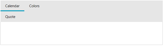
ReorderTabRows set to False
Allow Drag Reorder
You can allow/disallow the user to reorder the tab items of your control throught the AllowDragReorder.
The default value for the AllowDragReorder property is False.
Allow reordering the tab items
<telerik:RadTabControl x:Name="radTabControl" AllowDragReorder="True">
    <telerik:RadTabItem Header="Calendar"/>
    <telerik:RadTabItem Header="Colors"/>
    <telerik:RadTabItem Header="Quote"/>
</telerik:RadTabControl>
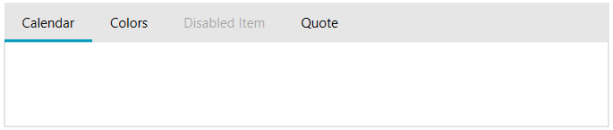
Enable or Disable Tab Items
You can set the IsEnabled property to prevent the user from interacting with the whole tab control or with certain tab items. You can find this property in both RadTabControl and RadTabItem.
Disable tab item
<telerik:RadTabControl x:Name="radTabControl">
    <telerik:RadTabItem Header="Calendar"/>
    <telerik:RadTabItem Header="Colors" />
    <telerik:RadTabItem Header="Disabled Item" IsEnabled="False"/>
    <telerik:RadTabItem Header="Quote"/>
</telerik:RadTabControl>
Tabstrip Placement
You can change the position of the tab strip throught the TabStripPlacement property. More information regarding this functionality can be found here
Overflow Mode
The overflow mode determines how the tab items will be handled in case there isn't enough space in the tabstrip to fit them. The mode is controlled via the OverflowMode property of RadTabControl. The default value is Scroll. When this mode is enabled and there isn't enough space for all tab items, two arrow buttons are displayed. The buttons allow you to scroll the tabs left and right.
When the overflow mode is Scroll, the mouse wheel can be used to scroll as well. In that case, scrolling the wheel up will move the items from right to left, and scrolling it down will move them from left ro right. To change the scroll direction on mouse wheel, set the InvertMouseWheelScrollDirection property of RadTabControl to true.
Invert the mouse wheel scroll direction
<telerik:RadTabControl InvertMouseWheelScrollDirection="True">
    <!-- large number of items -->
</telerik:RadTabControl>
Wrap. In that case, if no space is available for all tab items, they will be split into multiple rows.
Show all tab items in the viewport
<telerik:RadTabControl OverflowMode="Wrap">
    <!-- large number of items -->
</telerik:RadTabControl>
Allow Drag Over Tab
This property indicates whether dragging objects over a tab item will select this TabItem. The default value for the AllowDragOverTab property is False.
The DragOverTab feature will work only if the Telerik.Windows.Controls.DragDrop.RadDragAndDropManager is used.
Setting AllowDragOverTab to true
<telerik:RadTabControl x:Name="radTabControl" OverflowMode="Wrap"/>
Align
The RadTabControl allows you to control the alignment of the tab items in the row - Left, Right, Center, Justify. More information can be found in the Tabstrip alignment
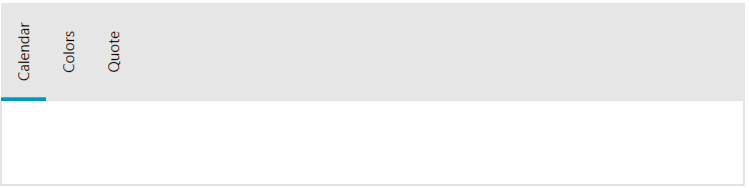
TabOrientation
RadTabControl allows you to control whether to display the tabs horizontally or vertically. You can do that through the Orientation property of the tab control. Its default value is Horizontal and therefore the items are positioned horizontally. Setting the property to Vertical will rotate the headers of the tab items at 90 degrees.
Change orientation of the tab items
<telerik:RadTabControl x:Name="radTabControl" TabOrientation="Vertical" >
    <telerik:RadTabItem Header="Calendar" />
    <telerik:RadTabItem Header="Colors" />
    <telerik:RadTabItem Header="Quote"/>
</telerik:RadTabControl>
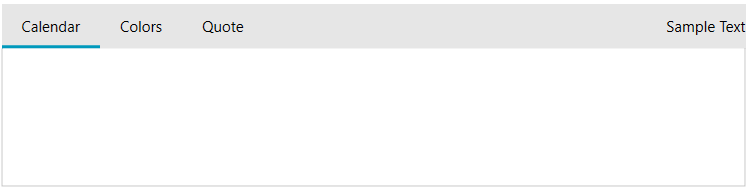
AdditionalContent
The RadTabControl control exposes a property, which allows you to display additional content on its right side of the control.
Add AdditionalContent
<telerik:RadTabControl x:Name="radTabControl" >
    <telerik:RadTabControl.AdditionalContent>
        <TextBlock Text="Sample Text" VerticalAlignment="Center"/>
    </telerik:RadTabControl.AdditionalContent>
    <telerik:RadTabItem Header="Calendar" />
    <telerik:RadTabItem Header="Colors" />
    <telerik:RadTabItem Header="Quote"/>
</telerik:RadTabControl>
Close Tab On Mouse Middle Button Click
To close the tab on mouse middle button down you can set the CloseTabsOnMouseMiddleButtonDown property of the RadTabControl to True.
Scroll Mode
When the width of the control does not allow all tabs to be displayed, two scrolling buttons appear to the left and to the right side of the tab items. You can choose one of the ScrollMode values in order to control how the tab items should be scrolled.
AllTabsEqualHeight
This property specifies whether all displayed tabs have equal height.
The default value for the AllTabsEqualHeight property is True.
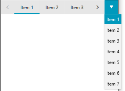
TabControl DropDown Menu
When the width of the control does not allow all tabs to be displayed, two scrolling buttons appear to the left and to the right side of the tab items. For faster navigation the control expose drop down menu which contains a list of all tab items inside the control. To show the dropdown button menu you can set the DropDownDisplayMode to __Visible.
The DropDownDisplayMode property could be set to any of the following values: * Collapsed: The drop down will never be shown. * Visible: The drop down will always be visible. * WhenNeeded: The drop down will be shown only when there is not enough space the Tabs to be arranged.
Show DropDownMenu button
<telerik:RadTabControl x:Name="radTabControl" DropDownDisplayMode="Visible">
    <!-- large number of items -->
</telerik:RadTabControl>