ToolTip
The tooltip of RadSlider enables the user to see the value of the slider's thumb while dragging it. In order to enable the ToolTip in the RadSlider component, you can set the AutoToolTipPlacement property. The property is an enumeration of type AutoToolTipPlacement and the possible values which can be set are None, TopLeft, BottomRight. The default value of the AutoToolTipPlacement property is None.
Example 1: Set AutoToolTipPlacement property to TopLeft in horizontal orientation
<telerik:RadSlider Minimum="0" Maximum="10" AutoToolTipPlacement="TopLeft"/>
Figure 1: Horizontal orientated sliders
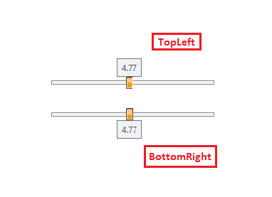
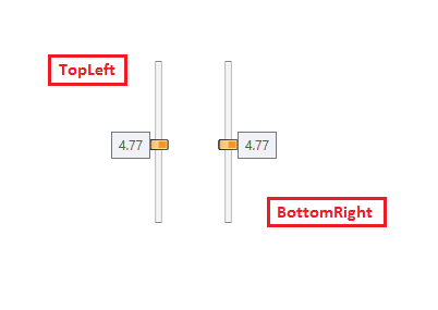
Figure 2: Vertical orientated sliders
ToolTip Value
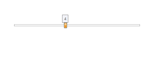
By default, the ToolTip displays the thumb's value with two decimal symbols of precision (52.42 for example). To change the precision or the default representation of the ToolTip content you can set the AutoToolTipContentTemplate property.
Example 3: Set custom DataTemplate to AutoToolTipContentTemplate property
<telerik:RadSlider Minimum="0" Maximum="10" AutoToolTipPlacement="TopLeft">
    <telerik:RadSlider.AutoToolTipContentTemplate>
        <DataTemplate>
            <TextBlock Text="{Binding .,StringFormat=F1}"/>
        </DataTemplate>
    </telerik:RadSlider.AutoToolTipContentTemplate>
</telerik:RadSlider>
Figure 3: Setting custom template to the AutoToolTipContentTemplate property
The value of the ToolTip might not display the actual Value/SelectionStart/SelectionEnd values of the slider. When the IsDeferredDraggingEnabled property is set to True, the value of the slider will be updated only when the user finishes the drag operation. Regardless this, the Value of the ToolTip will be updated corresponding to the current location of the thumb, indicating the value when you end the dragging.
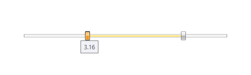
Range Selection
When selection range is enabled, the tooltip will appear on the start thumb or the end thumb depending on which one is dragged. The shown value will correspond to the SelectiondStart and SelectionEnd properties of the RadSlider.
Figure 4: ToolTip in range selection functionality
ThumbToolTipStyle
With the R2 2020 version of Telerik UI for WPF controls, the RadSlider control exposes a ThumbToolTipStyle property which can be used to customize the thumb tooltip. Example 4 demonstrates how we can use this property to add RadCallout control inside the thumb tooltip.
Example 4: Callout as a ToolTip for RadSlider Thumb
<telerik:RadSlider AutoToolTipPlacement="TopLeft" Minimum="0" Maximum="100" LargeChange="5" SmallChange="1" VerticalAlignment="Center" HorizontalAlignment="Center" Width="500" >
    <telerik:RadSlider.ThumbToolTipStyle>
        <Style TargetType="ToolTip">
            <Setter Property="BorderThickness" Value="0"/>
            <Setter Property="Background" Value="Transparent"/>
        </Style>
    </telerik:RadSlider.ThumbToolTipStyle>
    <telerik:RadSlider.AutoToolTipContentTemplate>
        <DataTemplate>
            <telerik:RadCallout  Margin="5 5 5 10" >
                <TextBlock Text="{Binding .,  StringFormat=N2}" />
            </telerik:RadCallout>
        </DataTemplate>
    </telerik:RadSlider.AutoToolTipContentTemplate>
</telerik:RadSlider>