Required Parts
The control template of RadProgressBar contains a number of elements needed for the correct functioning of the control. This section will explain the structure of the RadProgressBar's template. Here is a snapshot of the template generated in Expression Blend.
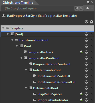
Here is a short description of some of the elements included in the default control template:
-
[Grid] - is of type Grid and represents the layout root for the template.
-
transformationRoot - a LayoutTransformControl that hosts the RadProgressBar template elements.
-
Root - this Grid element servers as the container wrapping all other elements in the control template.
- ProgressBarTrack - this Border element serves as the "empty" area of the ProgressBar which indicates the yet unfilled portion of the monitored operation.
-
ProgressBarRootGrid - this Grid element is used for positioning the elements it contains.
ProgressBarRootGradient - this element is used for styling purposes.
-
IndeterminateRoot - this Grid element contains all elements needed for the default visualization of the indeterminate state of the control.
- IndeterminateSolidFill - this element is used for styling purposes.
-
IndeterminateradientFill - this element is used for styling purposes.
-
DeterminateRoot - this Grid element contains all elements needed for the default visualization of the determinate state of the control.
- SkipValueSpacer- this element is used when the SkipValue property is set.
- ProgressBarIndicator - this element is used for rendering the current progress(value) in the control.
-
-