Radial Scale
This topic will explain you the specifics regarding the usage of the RadialScale control.
The RadialScale control allows you to display a scale of radial form. Typically the RadialScale is used in the 1 of the 9 radial gauge controls, but it can be directly used in the other Gauge controls available or even on its own. This topic will explain you the specifics regarding the usage of the RadialScale control.
As the scales provided by the Gauge control share common functionality, you might found useful to read the Base Scale topic. In it you will find information regarding the features shared between the different scales.
The scales derived from the Graphic Scale class, can use any of the indicators provided by the Gauge control. To learn how read the Base Scale topic.
Here is the list of the RadialScale features:
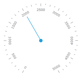
Multiplier
The Multiplier property of the Radial Scale allows applying a multiplier to the scale range and to the current value of each element which is displayed on the scale.
<telerik:RadRadialGauge telerik:StyleManager.Theme="Windows8">
    <telerik:RadialScale Min="0" Max="50" Multiplier="100">
        <telerik:RadialScale.Indicators>
            <telerik:Needle x:Name="needle" Value="20"/>
            <telerik:Pinpoint/>
        </telerik:RadialScale.Indicators>
    </telerik:RadialScale>
</telerik:RadRadialGauge>
Here is a snapshot of the result:
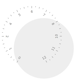
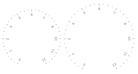
Scale Center
The RadialScale allows you to specify towards which point in its parent container it should get centered. This is done by using the Center property of the control. It represents a point which value is relative towards the cell size of the scale. For example, if you want to position the scale in the center of the parent container, you have to set the Center property to 0.5, 0.5(this is the default value). Here is an example where the center of the scale is 0.3, 0.3.
To learn more about the cell size term, read the Relative Measurements topic.
<telerik:RadRadialGauge OuterBackground="#EEEEEE" telerik:StyleManager.Theme="Windows8">
    <telerik:RadialScale Min="0"
                         Max="12"
                         Center="0.3,0.3">
    </telerik:RadialScale>
</telerik:RadRadialGauge>
Here is a snapshot of the result:
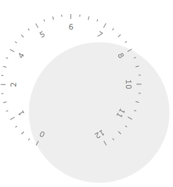
Label Rotation Mode
The RadialScale control allows you to specify the way the labels get rotated around the scale. This is done by using the LabelRotationMode enumeration property. It can have one of the following values:
Auto (default) - specifies that the labels get automatically rotated depending on their position on the scale.
None - specifies that the labels won't get rotated.
SurroundIn - specifies that the labels surround the radial scale with character’s base line directed towards the center of the scale.
SurroundOut - specifies that the labels surround the radial scale with character’s base line directed backwards the center of the scale.
Here is an example of RadialScale with a LabelRotationMode of SurroundOut:
<telerik:RadRadialGauge OuterBackground="#EEEEEE" telerik:StyleManager.Theme="Windows8">
    <telerik:RadialScale Min="0"
                         Max="12"
                         Center="0.3,0.3"
                         LabelRotationMode="SurroundOut">
    </telerik:RadialScale>
</telerik:RadRadialGauge>
Here is a snapshot of the result:
Scale Radius
You can specify the radius of the RadialScale. This is done via the Radius property. The value of the Radius property is relative to the cell size of the scale. For example if you set the radius to be 1.2, the width/height of the scale will be 20% larger than the width/height of the parent container. Here is an example of such RadialScale.
To learn more about the cell size term, read the Relative Measurements topic.
<telerik:RadRadialGauge Width="200" Height="200" telerik:StyleManager.Theme="Windows8">
    <telerik:RadialScale Min="0"
                         Max="12"
                         Radius="1">
    </telerik:RadialScale>
</telerik:RadRadialGauge>

<telerik:RadRadialGauge Width="200" Height="200" Grid.Column="2" telerik:StyleManager.Theme="Windows8">
    <telerik:RadialScale Min="0"
                         Max="12"
                         Radius="1.2">
    </telerik:RadialScale>
</telerik:RadRadialGauge>
Here is a snapshot of the result:
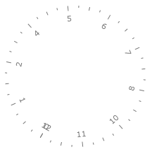
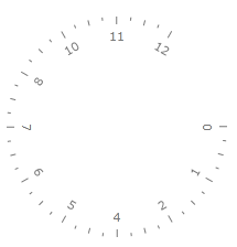
Start Angle
The StartAngle property of the Graphic Scale allows you to specify the angle from which the drawing of the scale should start. The default value is at 7 o'clock and a start angle of 0 will make the scale start at 3 o'clock. The value of the angle grows clockwise. Here is an example.
Another ways to control the positioning of the scale values is to use properties like the MajorTickStep, which are exposed by the ScaleBase control, from which the RadialScale derives. To learn more about the base features of the different scales, read the Base Scale topic.
<telerik:RadRadialGauge telerik:StyleManager.Theme="Windows8">
    <telerik:RadialScale Min="0"
                         Max="12"
                         StartAngle="0">
    </telerik:RadialScale>
</telerik:RadRadialGauge>
Here is a snapshot of the result:
Sweep Angle
The sweep angle represents the amount of the scale that is used to display ticks. By default there is space between the first and the last value of the scale.
If you want to specify the sweep angle use the SweepAngle property. For example a value of 360 will make the scale to form a complete circle and the first and the last value will overlap each other. A value of 180 will make the scale to use only half of the circle to display the values.
Here is an example:
<telerik:RadRadialGauge telerik:StyleManager.Theme="Windows8">
    <telerik:RadialScale Min="0"
                         Max="12"
                         SweepAngle="360">
    </telerik:RadialScale>
</telerik:RadRadialGauge>
Here is a snapshot of the result: