Styling the ToolWindow
ToolWindow is the container control that hosts all panes that are in a floating state. This article will demonstrate how to create a style targeting ToolWindow.
Targeting the ToolWindow Element
In order to style all ToolWindows in a RadDocking, you should create a style targeting ToolWindow.
Example 1: Creating an implicit style targeting ToolWindow
<Application.Resources>
    <!-- If you are using the NoXaml binaries, you will have to base the style on the default one for the theme like so:
    <Style TargetType="telerik:ToolWindow" BasedOn="{StaticResource ToolWindowStyle}">-->

    <Style TargetType="telerik:ToolWindow">
        <Setter Property="CanClose" Value="False" />
        <Setter Property="CornerRadius" Value="10" />
    </Style>
</Application.Resources>

<telerik:RadDocking>
    <telerik:RadSplitContainer InitialPosition="FloatingDockable">
        <telerik:RadPaneGroup >
            <telerik:RadPane Header="Pane 1"/>
        </telerik:RadPaneGroup>
    </telerik:RadSplitContainer>

    <telerik:RadSplitContainer >
        <telerik:RadPaneGroup >
            <telerik:RadPane Header="Pane 1"/>
        </telerik:RadPaneGroup>
    </telerik:RadSplitContainer>
</telerik:RadDocking>
It is important for the implicit style targeting ToolWindow to be placed in the Application's Resources as shown in Example 1. This is due to the fact that the ToolWindows are in a separate visual tree from the MainWindow.
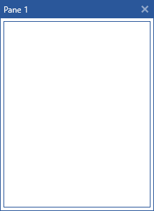
Figure 1: ToolWindow with disabled close button in the Office2016 theme
In order to learn how to further modify the control by extracting its ControlTemplate, read the Editing Control Templates article.