PathButton
With our Q3 2014 official release we introduced the RadPathButton control. It derives from the RadButton. This means it inherits all the features of the standard button. Additionally it adds a Path control to its default template. This allows you to easily add custom geometry to your button. You can instantiate this control in both XAML and code behind (see Example 1 and 2).
Example 1: Defining a button in XAML
<telerik:RadPathButton>
    <telerik:RadPathButton.PathGeometry>
        <EllipseGeometry RadiusX="10" RadiusY="10"></EllipseGeometry>
    </telerik:RadPathButton.PathGeometry>
</telerik:RadPathButton>
Example 2: Defining a button in code
RadPathButton pathButton = new RadPathButton() { PathGeometry = new EllipseGeometry() { RadiusX = 10, RadiusY = 10 } };
Dim pathButton As New RadPathButton() With { _
    .PathGeometry = New EllipseGeometry() With { _
        .RadiusX = 10, _
        .RadiusY = 10 _
    } _
}
Figure 1: The created path button

Note that in XAML you can directly use string format Path Markup Syntax
Example 3: Setting the path geometry in XAML
<telerik:RadPathButton PathGeometry="M3,7L9,7L9,4L13,8L9,12L9,9L3,9z" />
Example 3: Setting the path geometry in code
RadPathButton pathButton = new RadPathButton() { PathGeometry = GeometryParser.GetGeometry("M3,7L9,7L9,4L13,8L9,12L9,9L3,9z") };
Dim pathButton As New RadPathButton() With { _
    .PathGeometry = GeometryParser.GetGeometry("M3,7L9,7L9,4L13,8L9,12L9,9L3,9z") _
}
Figure 2: RadPathButton with PathGeometry

Customizing the RadPathButton
The RadPathButton exposes the ContentPlacement property. It is of type Dock and gets or sets this position of the content relative to the Path element. This property accepts Left, Top, Right and Bottom values. The default is Bottom.
Example 4: Setting the content position in XAML
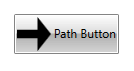
<telerik:RadPathButton Content="Path Button" ContentPlacement="Right" />
Example 5: Setting the content position in code
RadPathButton pathButton = new RadPathButton() { Content = "Path button", ContentPlacement = Dock.Right };
Dim pathButton As New RadPathButton() With { _
    .Content = "Path button", _
    .ContentPlacement = Dock.Right _
}
Figure 3: RadPathButton with ContentPlacement set to Right
In addition to all customizing options that are inherited from the RadButton the PathButton has a PathStyle property. This property gets or sets the style of the Path element in the template.
Example 5: Setting the content position in XAML
<telerik:RadPathButton.PathStyle>
    <Style TargetType="Path">
        <Setter Property="Fill" Value="Red" />
        <Setter Property="Stretch" Value="Fill" />
    </Style>
</telerik:RadPathButton.PathStyle>
Figure 4: RadPathButton with custom PathStyle

Also the RadPathButton exposes the ContentMargin property. It is of type Thickness and determines the margin around its content. This allows users to adjust size of the Path that the button hosts. For adjusting the position of the Path itself users can use the RadPathButton.Padding property.
Aligning the Path
By default, the Stretch property of the Path element is set to Fill. As a result, when the ContentPlacement of the button is set to Top or Bottom, only the HorizontalContentAlignment takes effect. Respectively, when the ContentPlacement is Left or Right, only the VerticalContentAlignment takes effect.
With the R1 2021 SP release you can now more intuitively place the path element of the button relatively to its content. For the purpose, you need to set the Stretch property of the Path to None and set the desired horizontal and vertical alignments.
Example 6: Setting the path alignment in XAML
<telerik:RadPathButton.PathStyle>
        <Style TargetType="Path">
            <Setter Property="Stretch" Value="None" />
            <Setter Property="HorizontalAlignment" Value="Right" />
            <Setter Property="VerticalAlignment" Value="Bottom" />
        </Style>
    </telerik:RadPathButton.PathStyle>
Figure 5: RadPathButton with different alignments
As seen in the image above you may also want to set appropriate values for the HorizontalContentAlignment and VerticalContentAlignment of the RadPathButton to align the content in the available space.