Customizing the DragVisual
This article demonstrates how to create a custom drag visual element for the DragDropBehavior by implementing the IDragVisualProvider interface.
The interface exposes the following members.
- UseDefaultCursors: A property that determines whether the drag/drop effects will change the mouse cursor or not.
- CreateDragVisual: A method that receives information about the dragged items and returns a FrameworkElement used as the drag visual.
- GetDragVisualOffset: A method that receives information about the dragged items and returns the drag visual offset relative to the mouse position, as a Point structure.
Implementing IDragVisualProvider
This section shows how to create a custom drag visual provider that allows you to define a custom DataTemplate and use it with any DragDropBehavior implementation.
Example 1: Creating a custom drag visual provider
public class CustomDragVisualProvider : DependencyObject, IDragVisualProvider
{
    public static readonly DependencyProperty DraggedItemTemplateProperty =
    DependencyProperty.Register(
        "DraggedItemTemplate",
        typeof(DataTemplate),
        typeof(CustomDragVisualProvider),
        new PropertyMetadata(null));

    public DataTemplate DraggedItemTemplate
    {
        get { return (DataTemplate)GetValue(DraggedItemTemplateProperty); }
        set { SetValue(DraggedItemTemplateProperty, value); }
    }

    public FrameworkElement CreateDragVisual(DragVisualProviderState state)
    {
        var visual = new DragVisual();
        visual.Content = state.DraggedItems.OfType<object>().FirstOrDefault();
        visual.ContentTemplate = this.DraggedItemTemplate;
        return visual;
    }

    public Point GetDragVisualOffset(DragVisualProviderState state)
    {
        return state.RelativeStartPoint;
    }

    public bool UseDefaultCursors { get; set; }
}
This approach is applicable for all controls that use a DragDropBehavior. For example, ScheduleViewDragDropBehavior, or a custom implementation of the DragDropBehavior class.
Using the Custom Drag Visual Provider
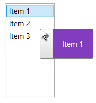
This section shows how to setup a ListBoxDragDropBehavior that will use the custom drag visual provider implemented in the previous section.
Example 2: Using the custom drag visual provider
<ListBox ItemsSource="{Binding MyItems}" DisplayMemberPath="Name">
    <ListBox.ItemContainerStyle>
        <Style TargetType="ListBoxItem">
            <Setter Property="telerik:DragDropManager.AllowCapturedDrag" Value="True" />
        </Style>
    </ListBox.ItemContainerStyle>
    <telerik:ListBoxDragDrop.Behavior>
        <telerik:ListBoxDragDropBehavior />
    </telerik:ListBoxDragDrop.Behavior>
    <telerik:ListBoxDragDrop.DragVisualProvider>
        <local:CustomDragVisualProvider>
            <local:CustomDragVisualProvider.DraggedItemTemplate>
                <DataTemplate>
                    <TextBlock Text="{Binding Name}" Background="#823DBF" Padding="15" Foreground="White"/>
                </DataTemplate>
            </local:CustomDragVisualProvider.DraggedItemTemplate>
        </local:CustomDragVisualProvider>
    </telerik:ListBoxDragDrop.DragVisualProvider>
</ListBox>
Figure 1: Custom drag visual provider