Steps
RadWizardStep represents one of the child views that can be displayed in the RadWizard.
RadWizard Properties:
Each RadWizardStep has the following properties:
Title - the text printed in RadWizardStep element.
ID - the id value that can be used in order to access this step on the server-side.
ToolTip - shows a text when user hovers on a RadWizardStep.
Enabled - enables/disables the RadWizardStep.
AllowReturn - allows/prevents the step from being activated more than once. The default value is "True" and users are able to go back to this step as many times as they want.
AllowReturn="False"is tracked correctly when the steps are changed only on the client or only on the server.DisplayCancel - shows/hides the cancel button for a step.
ValidationGroup - specifies which group of controls is validated on validation.
CausesValidation - enables/disables the validation functionality if user tries to change the current step.
ImageUrl - specifies an image to be displayed as an icon next to the RadWizardStep. The position of this image is controlled by the property ImagePosition defined globally for the RadWizard control.
ActiveImageUrl, DisabledImageUrl, HoveredImageUrl - like ImageUrl specifies an image to be displayed for the active, disabled and hovered step.
SpriteCssClass - replaces the step image element with a sized span for easier use of sprites. This property value is applied to the rendered span element as a class attribute. In this CSS class rule you can define the the path to the background image.
In order to use any of the following properties ActiveImageUrl, DisabledImageUrl, HoveredImageUrl it requires setting the ImageUrl as well.
Along with the already mentioned properties the RadWizardStep provides a StepType property.Different step types provide specific predefined layout and functionality ready to be used in real world scenarios.
The following types are:
Start - includes just a Next button.
Step - includes both a Next and Previous button.
Finish - includes Previous and Finish buttons
Complete - displays a summary of the task performed after the Finish button has been clicked from the Finish step.
Auto - (the default) the rendered navigation buttons are automatically determined based on the index of the step itself as follows: the first step in the wizard is assumed to be the Start step, the last step the Finish step, and all other steps are considered Step steps; no step is automatically considered a Complete step (if you want a Complete step, it must be explicitly specified).
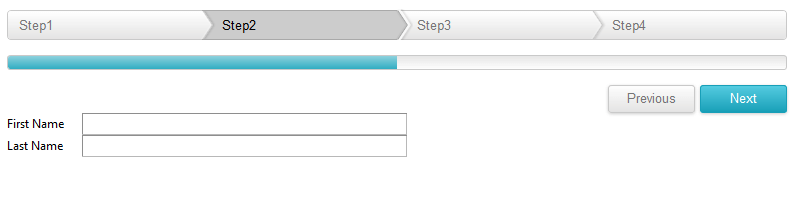
Navigation Buttons:
Figure 1: RadWizard Navigation buttons

The RadWizardStep navigation buttons are special buttons for navigation between the steps and by default are positioned at the bottom of the RadWizard These buttons Next, Previous, Finish and Cancel navigation buttons are generated based on the current RadWizard StepType. Each of them can be localized and has a separate server and client event that can be handled.
As of Q3 2014 SP1 you are able to hide and position top the RadWizardStep navigation buttons:
You can set the RadWizardStep DisplayNavigationButtons="false" to hide the navigation buttons.
-
You can set the RadWizardStep NavigationButtonsPosition="Top" to position top the navigation buttons as shown in the screen shot below:
Figure 2: RadWizard Navigation buttons top positioned