Structure
The structure of the RadToolBar control is as follows:
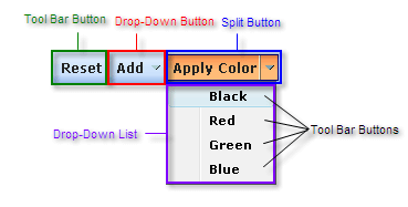
The toolbar is a container that holds different types of buttons. There are three types of buttons that can appear in the toolbar. Each button type is a descendant of RadToolBarItem:
Tool Bar Buttons: Tool bar buttons (RadToolBarButton) are buttons that the user can click to perform some task.
Drop-Down Buttons: Drop-down buttons (RadToolBarDropDown) do not perform a task. Instead, when the user clicks a drop-down button, it displays its drop-down list. The drop-down list contains one or more toolbar buttons that the user can click to perform some task.
Split Buttons: Split buttons (RadToolBarSplitButton) combine the features of toolbar buttons and drop-down buttons. When the user clicks on a split button, it performs a task like a toolbar button. When the user clicks on the drop-down arrow, it opens a drop-down list, where the user can click on a toolbar button.
The buttons in the toolbar are contained in the Items collection of the RadToolBar object. The buttons in the drop-down list of a RadToolBarDropDown or RadToolBarSplitButton are contained in the Buttons collection of the drop-down button or split button:
<telerik:RadToolBar RenderMode="Lightweight" ID="RadToolBar1" runat="server" Skin="Outlook">
    <Items>
        <telerik:RadToolBarButton runat="server" Text="Reset" />
        <telerik:RadToolBarDropDown runat="server" Text="Add">
            <Buttons>
                <telerik:RadToolBarButton runat="server" Text="Row Above" />
                <telerik:RadToolBarButton runat="server" Text="Row Below" />
                <telerik:RadToolBarButton runat="server" IsSeparator="True" />
                <telerik:RadToolBarButton runat="server" Text="Column Left" />
                <telerik:RadToolBarButton runat="server" Text="Column Right" />
            </Buttons>
        </telerik:RadToolBarDropDown>
        <telerik:RadToolBarSplitButton runat="server" Text="Apply Color" EnableDefaultButton="False">
            <Buttons>
                <telerik:RadToolBarButton runat="server" Text="Black" />
                <telerik:RadToolBarButton runat="server" Text="Red" />
                <telerik:RadToolBarButton runat="server" Text="Green" />
                <telerik:RadToolBarButton runat="server" Text="Blue" />
            </Buttons>
        </telerik:RadToolBarSplitButton>
    </Items>
</telerik:RadToolBar>