Responsive Design
Since Q1 2016 the RadToolBar control is fully responsive. It adapts to screen resizing by collapsing its elements under a dropdown button, if there is not enough space to display them all. When the button is clicked a dropdown containing the collapsed items is displayed.
The RadToolBar's responsive design is available only in Lightweight RenderMode.
The following example demonstrates the RadToolBar's responsive design capabilities.
Full-size RadToolBar:

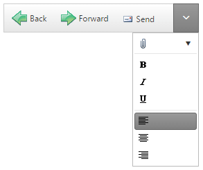
RadToolBar with some of its elements collapsed:
<telerik:RadToolBar RenderMode="Lightweight" ID="RadToolBar1" runat="server">
    <Items>
        <telerik:RadToolBarButton ImageUrl="~/Images/back.png"
            Text="Back" ToolTip="Back">
        </telerik:RadToolBarButton>
        <telerik:RadToolBarButton ImageUrl="~/Images/forward.png"
            Text="Forward" ToolTip="Forward">
        </telerik:RadToolBarButton>
        <telerik:RadToolBarButton ImageUrl="Images/send.gif"
            Text="Send" ToolTip="Send">
        </telerik:RadToolBarButton>
        <telerik:RadToolBarSplitButton ImageUrl="Images/attach.gif"
            EnableDefaultButton="false">
            <Buttons>
                <telerik:RadToolBarButton ImageUrl="Images/attach.gif"
                    Text="File" ToolTip="Attach File">
                </telerik:RadToolBarButton>
                <telerik:RadToolBarButton Text="Item" ToolTip="Attach Item">
                </telerik:RadToolBarButton>
            </Buttons>
        </telerik:RadToolBarSplitButton>
        <telerik:RadToolBarButton IsSeparator="true">
        </telerik:RadToolBarButton>
        <telerik:RadToolBarButton ImageUrl="Images/bold.gif"
            CheckOnClick="true" Group="Bold" AllowSelfUnCheck="true" ToolTip="Bold">
        </telerik:RadToolBarButton>
        <telerik:RadToolBarButton ImageUrl="Images/italic.gif"
            CheckOnClick="true" Group="Italic" AllowSelfUnCheck="true" ToolTip="Italic">
        </telerik:RadToolBarButton>
        <telerik:RadToolBarButton ImageUrl="Images/underline.gif"
            CheckOnClick="true" Group="Underline" AllowSelfUnCheck="true" ToolTip="Underline">
        </telerik:RadToolBarButton>
        <telerik:RadToolBarButton IsSeparator="true">
        </telerik:RadToolBarButton>
        <telerik:RadToolBarButton ImageUrl="Images/left.gif"
            ToolTip="Align Left" CheckOnClick="true" Group="Align" Checked="true">
        </telerik:RadToolBarButton>
        <telerik:RadToolBarButton ImageUrl="Images/center.gif"
            ToolTip="Align Center" CheckOnClick="true" Group="Align">
        </telerik:RadToolBarButton>
        <telerik:RadToolBarButton ImageUrl="Images/right.gif"
            ToolTip="Align Right" CheckOnClick="true" Group="Align">
        </telerik:RadToolBarButton>
    </Items>
</telerik:RadToolBar>
If you call the
.hide()or.show()methods of individual items, make sure to call the.repaint()method of the toolbar afterwards so that the toolbar can re-calculate which buttons are to be collapsed.
All items with the same value for the
Groupproperty collapse or expand together.
If you have responsiveness issues running your app on iOS or iframe container, you can try setting CSS rules to remedy this. Here is a sample:
<style>
    [id*='iframe-'] {
        position: relative;
        height: 0;
        max-height: 100%;
        max-width: 100%;
        min-height: 100%;
        min-width: 100%;
        width: 0;
    }
</style>
Preventing items from being collapsed
You can prevent items from being collapsed and moved to the dropdown on screen resize, by setting their OverFlow property to Never:
...
<telerik:RadToolBarButton ImageUrl="Images/bold.gif"
    CheckOnClick="true" Group="Bold" AllowSelfUnCheck="true" ToolTip="Bold" OverFlow="Never">
</telerik:RadToolBarButton>
...