Understanding the Skin CSS File
Styles for Telerik controls are defined using Cascading Style Sheet (CSS) syntax. Each style consists of a selector that identifies an HTML element to be styled, and property/value pairs that describe each of the style specifics, e.g. color, padding, margins, etc. For example, the ".RadSplitter_Default .resizeBarOverHorizontal" style defines the color of a split bar when the mouse hovers over it:
.RadSplitter_Default .resizeBarOverHorizontal
{
    background: #383838;
}
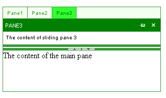
See the CSS Skin File Selectors topic for more information on the specific CSS selectors used for RadSplitter skins. You can see custom styles applied in the screenshot below:
Each style maps to a "class" attribute in an HTML tag. For example, consider the HTML rendering of a horizontal RadSplitter control such as the one shown above:
<div id="RadSplitter1" >
 <table id="RAD_SPLITTER_RadSplitter1" class="RadSplitter_Green" ...>
   <tr id="RAD_SPLITTER_PANE_TR_RadPane1">
     <td id="RadPane1" valign="top" class="paneHorizontal firstItem" ...>
       <div id="RAD_SPLITTER_PANE_CONTENT_RadPane1"  style="height:80px;overflow:auto;">
         ...
       </div>
       <input id="RadPane1_ClientState" ... />
     </td>
   </tr>
   <tr>
     <td id="RadSplitBar1" class="resizeBarHorizontal" ...>
       <div ... class="collapseBarHorizontalWrapper">
         <div ... class="collapseBarHorizontalCollapse" title="Collapse/expand the top pane">
           <!-- / -->
  </div>
         <div ... class="collapseBarHorizontalExpand" title="Collapse/expand the bottom pane">
    <!-- / -->
  </div>
</div>
       <input id="RadSplitBar1_ClientState" ... />
     </td>
   </tr>
   <tr id="RAD_SPLITTER_PANE_TR_RadPane2">
     <td id="RadPane2" valign="top" class="paneHorizontal lastItem" ...>
       <div id="RAD_SPLITTER_PANE_CONTENT_RadPane2"  ...>
         ...
       </div>
       <input id="RadPane2_ClientState" ... />
     </td>
   </tr>
   <input id="RadSplitter1_ClientState" ... />
 </table>
</div>
The entire splitter is rendered as a <div> element, but the layout is handled by a <table> element nested inside that <div> element. The <table> elementhas the RadSplitter_Green class applied. The RadSplitter_Green class is applied because the Skin property was set to "Green". If the splitter were nested inside the pane of another splitter, the <table> would also have the .nested or .nestedHorizontal class applied (depending on the orientation of the splitter).
Each pane of a splitter is a cell in the main table.The <td> elements that represent panes in the example above have the .paneHorizontal class applied. In a splitter with a vertical orientation, they would have the .pane class applied instead. In addition, the first pane has the .firstItem class applied and the last pane has the .lastItem class applied.
The split bar is also a cell in the main table. The <td> element that represents a split bar in the example has the .resizeBarHorizontal class applied.In a splitter with a vertical orientation, it would have the .resizeBar class applied instead.
Inside the cell for the split bar is a <div> element with the .collapseBarHorizontalWrapper class applied. This is the region of the split bar set aside for collapse and expand controls. On a vertical split bar, it would have the .collapseBarWrapper class applied instead.
Inside the <div> with the .collapseBarHorizontalWrapper class are <div> elements for the actual collapse and expand buttons. They have the .collapseBarHorizontalCollapse and .collapseBarHorizontalExpand classes applied. (In a vertical split bar, these would be the .collapseBarCollapse and .collapseBarExpand classes.)