Elastic Design
This article explains the fluid design capabilities RadSocialShare offers.
Generally, responsive design means that the page and its content are able to adapt to different screen resolutions without deteriorating the user experience. This often includes changing the font size and having dimensions set in percent.
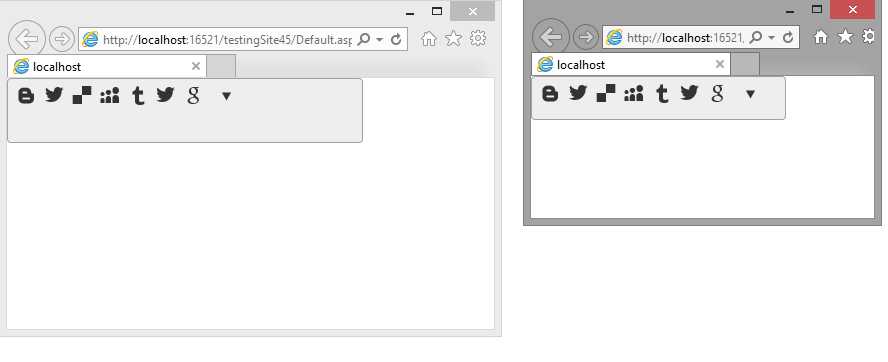
Figure 1: RadSocialShare with dimensions set to 100% that occupies its entire parent element
You can set the Width and Height properties of the RadSocialShare in percent. This lets it resize together with its parent element.
Example 1: A RadSocialShare that resizes with the parent element.
html, body, form
{
    height: 100%;
    margin: 0;
    padding: 0;
}
<div style="width: 70%; height: 20%;">
    <telerik:RadSocialShare  RenderMode="Lightweight" runat="server" ID="RadSocialShare1" Width="100%" Height="100%">
        <MainButtons>
            <telerik:RadSocialButton SocialNetType="Blogger" />
            <telerik:RadSocialButton SocialNetType="ShareOnTwitter" ToolTip="Tweet this" />
            <telerik:RadSocialButton SocialNetType="Delicious" ToolTip="Share on Delicious" />
            <telerik:RadSocialButton SocialNetType="MySpace" ToolTip="Share on MySpace" />
            <telerik:RadSocialButton SocialNetType="Tumblr" ToolTip="Share on Tumblr" />
            <telerik:RadSocialButton SocialNetType="ShareOnTwitter" ToolTip="Tweet this" />
            <telerik:RadSocialButton SocialNetType="GoogleBookmarks" ToolTip="Share on GoogleBookmarks" />
            <telerik:RadCompactButton />
        </MainButtons>
    </telerik:RadSocialShare>
</div>