Custom Label
The RadProgressBar's Label is the message (word, number, percent) that displays the level of process completion. This article explains the default status label of the control, how to customize its text or how to hide it.
The Label functionality is supported only for Value and Percent RadProgressBartypes.
Use the Default Progress Label
By default, the ProgressBar's Label displays the current Value of the progress indicator, when the control’s BarType is either Value or Percent. You can hide the Label by setting the ShowLabel property to false.
Figure 1: RadProgressBar with enabled and disabled Label visibility.
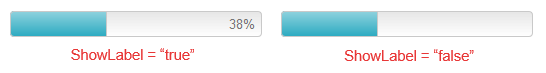
Example 1: Configure the visibility of the progress Label in a RadProgressBar with value in percent. The result of this example is displayed in Figure 1.
<telerik:RadProgressBar RenderMode="Lightweight" runat="server" ID="RadProgressBar1" Value="38" Skin="Silk" BarType="Percent" Width="250px" ShowLabel="true" >
</telerik:RadProgressBar>
<telerik:RadProgressBar RenderMode="Lightweight" runat="server" ID="RadProgressBar2" Value="38" Skin="Silk" BarType="Percent" Width="250px" ShowLabel="false">
</telerik:RadProgressBar>
Use a Custom Progress Label
If you want to customize the displayed label, you can show the desired progress message by configuring the RadProgressBar’s Label property (see Example 2). You can also see how to change the Label values dynamically client-side in the Custom Label demo.
Figure 2: RadProgressBar displaying a custom progress label.
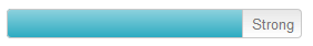
Example 2: Configure RadProgressBar to display a custom progress label. The result of this example is displayed in Figure 2.
<telerik:RadProgressBar RenderMode="Lightweight" runat="server" Width="264px" ID="PasswordStrengtProgress"
    MaxValue="10" Value="8" ShowLabel="true" Label="Strong" Skin="Silk">
</telerik:RadProgressBar>