Columns
This article provides information about columns that you can use in the RadPageLayout control. Once you set the needed rows in the RadPageLayout you can further extend its content to hold the need controls in either LayoutColumn or CompositeLayoutColumn. In this article you can also find out what attributes can be applied and how to declare them on your page.
Columns in RadPageLayout
A column or also declared as a LayoutColumn element in the markup code of the RadPageLayout control is the structural unit of design. If you are not familiar with grid systems, you can view them as a sort of table cell (but not quite). The LayoutColumn has span attribute that sets the size (or width) of a column (measured in grid units).
The grid unit itself is an abstract unit and represents fraction of the total container width. In the case of this control, one grid unit equals 1/12 of the total width.
In addition to the standard attributes, a column has few specific attributes that are listed below:
| Property Name | Description | Type | Default value |
|---|---|---|---|
| Span | Gets or sets the span (size or width) of the column. | Grid units / number | 12 |
| Pull | Moves the column element to the left without affecting other content. Could be applied globally, or per screen size, using one of the following properties: PullXs , PullSm , PullMd , PullLg or PullXl . | Grid units / number | 0 |
| Push | Moves the column element to the right without affecting other content. Could be applied globally, or per screen size, using one of the following properties: PushXs , PushSm , PushMd , PushLg or PushXl . | Grid units / number | 0 |
| Offset | Moves the column element to the left or right and affects other content. Could be applied globally, or per screen size, using one of the following properties: OffsetXs , OffsetSm , OffsetMd , OffsetLg or OffsetXl . | Grid units / number | 0 |
| HtmlTag | Gets or sets the HTML tag that will be rendered for this element. If the property is not set, it will return DIV element; if the property is set to None, only the element's content will be rendered. | tag | <div> |
| StaticID | Gets or sets the actual rendered ID attribute. If the property is not set, it will return an empty string. | ID / string | none |
Pull and Push properties are implemented using position: absolute CSS rule and position coordinates. In consequence, the change in the position of a column using those two properties will not affect the other content (columns). At the same time, Offset property applies the customizations on the margin CSS property of the column. Therefore, using Offset will affect (move) other content (columns).
<meta name="viewport" content="width=device-width, initial-scale=1.0" />
<style>
    .borderCssClass div {
        border: 1px solid red;
    }
</style>
<telerik:RadPageLayout ID="RadPageLayout1" runat="server">
    <Rows>
        <telerik:LayoutRow>
            <Columns>
                <telerik:LayoutColumn Span="8">
                    Main content here
                </telerik:LayoutColumn>
                <telerik:LayoutColumn Span="4">
                    Sidebar here
                </telerik:LayoutColumn>
            </Columns>
        </telerik:LayoutRow>
    </Rows>
</telerik:RadPageLayout>
Figure 1. RadPageLayout control

Composite Columns in RadPageLayout
Composite columns have the same attributes as "simple" columns.
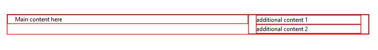
A CompositeLayoutColumn is a structural unit of design that can hold different elements that need to be positioned in a specific way on the page. In the code below you can get a better idea how to use it.
.borderCssClass div {
    border: 1px solid red;
}
<telerik:RadPageLayout ID="RadPageLayout1" runat="server" GridType="Fluid" CssClass="borderCssClass">
    <Rows>
        <telerik:LayoutRow >
                     <Columns>
                <telerik:LayoutColumn Span="8">
                    Main content here
                </telerik:LayoutColumn>
                <telerik:CompositeLayoutColumn Span="4">
                    <Rows>
                        <telerik:LayoutRow>
                            <Content>additional content 1</Content>
                        </telerik:LayoutRow>
                        <telerik:LayoutRow>
                            <Content> additional content 2</Content>
                        </telerik:LayoutRow>
                    </Rows>

                </telerik:CompositeLayoutColumn>
            </Columns>
        </telerik:LayoutRow>
   </Rows>
</telerik:RadPageLayout>
Figure 2. RadPageLayout control