Layout of Child Items
By default, when the user expands a menu item from a horizontal layout, the child items appear immediately below it, stacked vertically. When the user expands a menu item from a vertical layout, the child items appear immediately beside it, stacked vertically:
You can change this default layout of child items using the GroupSettings property of the parent item. To access the GroupSettings property at design time, select the item in the RadMenu Item Builder.
GroupSettings is a composite property, with the following sub-properties:
ExpandDirection determines where the list of child items appears relative to the parent item.
Auto (the default) causes child items to inherit the expand direction that applied to the parent item.
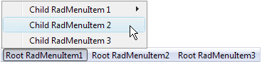
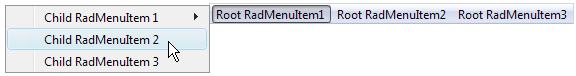
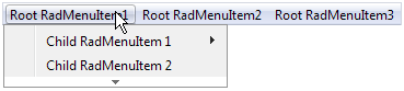
Up causes child items to appear above the parent item:
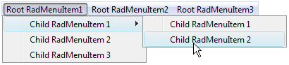
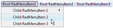
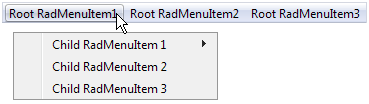
Down causes child items to appear below the parent item:
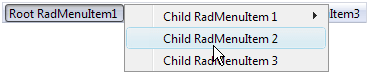
Left causes child items to appear to the left of the parent item:
Right causes child items to appear to the right the parent item:
By default, if the specified ExpandDirection would cause items to cross a screen boundary, the list of child items appears in the opposite direction from the one specified. You can override this behavior by setting the EnableScreenBoundaryDetection property to False .
Flow controls how the child items are stacked.
When Flow is Vertical (the default) child items appear on top of each other:
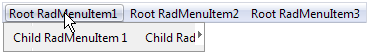
When Flow is Horizontal, child items appear beside each other

Height and Width control the height and width of the area in which the child items can expand. When Flow is Vertical, and Height is too small to fit all items, the list of items becomes scrollable:
Similarly, when Flow is Horizontal, and Width is too small to fit all items, the list of items becomes scrollable:
-
OffsetX and OffsetY are the offsets, in pixels, of the child items from the parent item. Setting these sub-properties lets you specify a gap between the parent item and its child items:
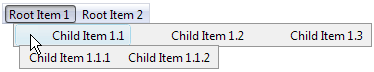
The following RadMenu declaration shows how the GroupSettings is attached to the parent menu item. It gives all items that have children an ExpandDirection of Down, a Flow of Horizontal, and an OffsetX of 10 pixels:
<telerik:RadMenu RenderMode="Lightweight" ID="RadMenu1" runat="server" Flow="Horizontal" Skin="Vista">
    <Items>
        <telerik:RadMenuItem runat="server" Text="Root Item 1">
            <Items>
                <telerik:RadMenuItem runat="server" Text="Child Item 1.1">
                    <GroupSettings ExpandDirection="Down" Flow="Horizontal" OffsetX="10" />
                    <Items>
                        <telerik:RadMenuItem runat="server" Text="Child Item 1.1.1">
                            <GroupSettings ExpandDirection="Auto" Flow="Vertical" />
                        </telerik:RadMenuItem>
                        <telerik:RadMenuItem runat="server" Text="Child Item 1.1.2">
                            <GroupSettings ExpandDirection="Auto" Flow="Vertical" />
                        </telerik:RadMenuItem>
                    </Items>
                </telerik:RadMenuItem>
                <telerik:RadMenuItem runat="server" Text="Child Item 1.2">
                    <GroupSettings ExpandDirection="Auto" Flow="Vertical" />
                </telerik:RadMenuItem>
                <telerik:RadMenuItem runat="server" Text="Child Item 1.3">
                    <GroupSettings ExpandDirection="Auto" Flow="Vertical" />
                </telerik:RadMenuItem>
            </Items>
            <GroupSettings ExpandDirection="Down" Flow="Horizontal" OffsetX="10" />
        </telerik:RadMenuItem>
        <telerik:RadMenuItem runat="server" Text="Root Item 2">
            <Items>
                <telerik:RadMenuItem runat="server" Text="Child Item 2.1">
                    <GroupSettings ExpandDirection="Auto" Flow="Vertical" />
                </telerik:RadMenuItem>
                <telerik:RadMenuItem runat="server" Text="Child Item 2.2">
                    <GroupSettings ExpandDirection="Auto" Flow="Vertical" />
                </telerik:RadMenuItem>
            </Items>
            <GroupSettings ExpandDirection="Down" Flow="Horizontal" OffsetX="10" />
        </telerik:RadMenuItem>
    </Items>
</telerik:RadMenu>
This produces the following menu:
The RepeatColumns property specifies the number of columns. (added in Q3 2009)
The RepeatDirection property determines the order in which the items are rendered. (added in Q3 2009)