Embedded Icons
This help article shows how to use embedded icons in RadLinkButton, lists the necessary CSS classes and describes the skins specifics.
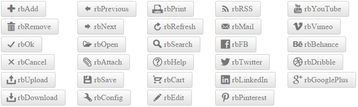
Figure 1: List of Embedded icons in RadLinkButton.
You can also use custom icons (image or font icons) and fine-tune their position, color and size.
Configuration
To make the control easier to use, Telerik provides a large set of built-in icons (Figure 1). To use them, set the Icon.CssClass property (Example 1) to one of the predefined CSS class names, and the respective icon will be shown on the control.
Figure 2: RadLinkButton with an embedded icon (Icon.CssClass="rbOk") from Example 1.
Example 1: Declaration of embedded icon in RadLinkButton.
<telerik:RadLinkButton ID="RadLinkButton1" runat="server" Text="Button with Icon" NavigateUrl="https://www.telerik.com" Target="_blank">
    <Icon CssClass="rbOk" />
</telerik:RadLinkButton>
CssClass List of Embedded Icons
You can find below the full list of CSS classes responsible for the embedded icons in RadLinkButton. The CssClass is composed in the following way: [r]ad[b]utton[IconName]. For example rbAdd.
| rbAdd | rbPrevious | rbPrint | rbRSS | rbYouTube |
| rbRemove | rbNext | rbRefresh | rbMail | rbVimeo |
| rbOk | rbOpen | rbSearch | rbFB | rbBehance |
| rbCancel | rbAttach | rbHelp | rbTwitter | rbDribble |
| rbUpload | rbSave | rbCart | rbLinkedIn | rbGooglePlus |
| rbDownload | rbConfig | rbEdit | rbPinterest |
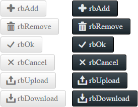
Skins Specifics
The color of the predefined icons can be white or black, depending on the chosen Skin. You can see the difference for the Silk and Glow skin in Figure 3.
Figure 3: Embedded icons in RadLinkButton for the Silk and Glow skin have white and black colors.