Fluid Design
This article explains the fluid design capabilities RadImageButton offers. Example 1 shows how you can set button size in percent so it can resize with its parent element. If you need the image to also respect the button size, you need to set the Sizing property of the Image tag to Stretch.
Generally, responsive design means that the page and its content are able to adapt to different screen resolutions without deteriorating the user experience. This often includes changing the font size and having dimensions set in percent.
Figure 1: RadImageButton set to 100% width and 25% height.
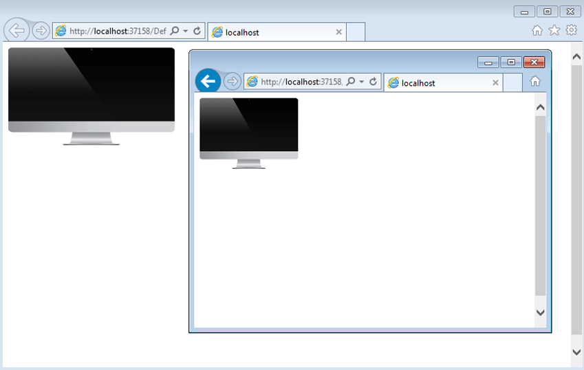
Example 1: Markup that provides fluid design of the RadImageButton in Figure 1.
<style>
    html, body, form {
        height: 100%;
    }
</style>

<div style="width: 30%; height: 30%;">
    <telerik:RadImageButton runat="server" ID="ImageButton"
        Skin="Default" Width="100%" Height="100%">
        <Image Url="images/iMac_normal.png" Sizing="Stretch" />
    </telerik:RadImageButton>
</div>
You can download the image used in this example from here—iMac_normal.png.