Plot Threshold Lines
This help article provides different approaches for plotting threshold lines in RadHtmlChart.
- Plot Threshold Lines via Visual Templates and Kendo UI Drawing API
- Plot Threshold Lines via Additional Series
- Plot Threshold Lines via Plot Bands
Plot Threshold Lines via Visual Templates and Kendo UI Drawing API
You can plot threshold lines in the RadHtmlChart via the Kendo UI Drawing API. This can be done once the chart is rendered or during the rendering itself via the Visual Template. The examples below shows how to plot threshold lines per a different granularity - chart, categories and items within categories.
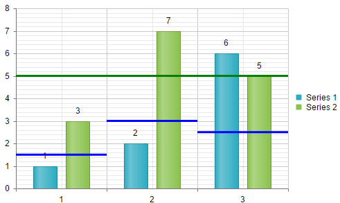
Plot Threshold Lines After Chart Rendering
Example 1 illustrates how to draw threshold lines in the chart once it is rendered. The sample shows two types of threshold lines - individual lines for each category and a common line for the whole chart. The threshold values are hardcoded at the top of the example. You can see the output in Figure 1.
Example 1: Render threshold liens after rendering the chart. The output is available in Figure 1.
var commonThresholdValue = 5;
var thresholdValues = [1.5, 3, 2.5];

function OnLoad(chart) {
    setTimeout(function () {
        var kendoChart;
        if (chart instanceof (Telerik.Web.UI.RadHtmlChart)) {
            kendoChart = chart.get_kendoWidget();
        }
        else {
            kendoChart = chart.sender;
        }

        var valueAxis = kendoChart.getAxis("value");
        var categoryAxis = kendoChart.getAxis("category");

        var catetgoriesCount = categoryAxis._axis.labelsCount();
        for (var i = 0; i < catetgoriesCount; i++) {
            plotThresholdLine(kendoChart, categoryAxis.slot(i, i + 1), valueAxis.slot(thresholdValues[i]), "blue")
        }
        plotThresholdLine(kendoChart, categoryAxis.slot(0, catetgoriesCount), valueAxis.slot(commonThresholdValue), "green");
    }, 100);
}

function plotThresholdLine(chart, xSlot, ySlot, colorLine) {
    var path = new kendo.drawing.Path({
        stroke: {
            color: colorLine,
            width: 3
        }
    }).moveTo(xSlot.origin.x, ySlot.origin.y)
    .lineTo(xSlot.bottomRight().x, ySlot.origin.y);
    chart.surface.draw(path);
}
<telerik:RadHtmlChart runat="server" ID="RadHtmlChart1" Width="500px" Height="300px" Skin="Silk">
    <ClientEvents OnLoad="OnLoad" OnLegendItemClick="OnLoad" />
    <PlotArea>
        <Series>
            <telerik:ColumnSeries Name="Series 1">
                <SeriesItems>
                    <telerik:CategorySeriesItem Y="1" />
                    <telerik:CategorySeriesItem Y="2" />
                    <telerik:CategorySeriesItem Y="6" />
                </SeriesItems>
            </telerik:ColumnSeries>
            <telerik:ColumnSeries Name="Series 2">
                <SeriesItems>
                    <telerik:CategorySeriesItem Y="3" />
                    <telerik:CategorySeriesItem Y="7" />
                    <telerik:CategorySeriesItem Y="5" />
                </SeriesItems>
            </telerik:ColumnSeries>
        </Series>
        <YAxis Name="value"></YAxis>
        <XAxis Name="category">
            <Items>
                <telerik:AxisItem LabelText="1" />
                <telerik:AxisItem LabelText="2" />
                <telerik:AxisItem LabelText="3" />
            </Items>
        </XAxis>
    </PlotArea>
</telerik:RadHtmlChart>
Figure 1: RadHtmlChart with a common threshold line and threshold lines for each category.
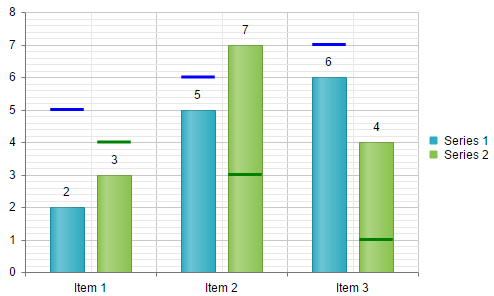
Plot Threshold Lines via Visual Templates
Example 2 illustrates how to dynamically plot threshold lines for each item of a series for a data-bound chart via the Visual Template of the series. The values for the threshold lines and the corresponding colors are stored in the threshold[index] and colorField[index] data source fields.
Example 2: The example that plots dynamically threshold lines. The output is available in Figure 2.
function visual(e) {
    var thresholdValue = e.dataItem["threshold" + e.series.index];
    var thresholdColor = e.dataItem["colorField" + e.series.index];

    var valueSlot = e.sender.getAxis("myYaxis").slot(thresholdValue);

    var path = new kendo.drawing.Path({
        stroke: {
            color: thresholdColor,
            width: 3
        }
    }).moveTo(e.rect.bottomLeft().x, valueSlot.origin.y)
    .lineTo(e.rect.bottomRight().x, valueSlot.origin.y);

    var defaultVisual = e.createVisual();

    var group = new kendo.drawing.Group();
    group.append(defaultVisual, path);

    return group;
}
<telerik:RadHtmlChart runat="server" ID="RadHtmlChart2" Width="500px" Height="300px" Skin="Silk">
    <PlotArea>
        <Series>
            <telerik:ColumnSeries Name="Series 1" DataFieldY="yField0">
                <Appearance Visual="visual"></Appearance>
            </telerik:ColumnSeries>
            <telerik:ColumnSeries Name="Series 2" DataFieldY="yField1">
                <Appearance Visual="visual"></Appearance>
            </telerik:ColumnSeries>
        </Series>
        <YAxis Name="myYaxis"></YAxis>
        <XAxis DataLabelsField="catField">
        </XAxis>
    </PlotArea>
</telerik:RadHtmlChart>
protected void Page_Load(object sender, EventArgs e)
{
    RadHtmlChart2.DataSource = GetData();
    RadHtmlChart2.DataBind();
}

protected DataTable GetData()
{
    DataTable dt = new DataTable();

    dt.Columns.Add("ID", typeof(int));
    dt.Columns.Add("yField0", typeof(int));
    dt.Columns.Add("yField1", typeof(int));
    dt.Columns.Add("threshold0", typeof(int));
    dt.Columns.Add("threshold1", typeof(int));
    dt.Columns.Add("colorField0", typeof(string));
    dt.Columns.Add("colorField1", typeof(string));
    dt.Columns.Add("catField", typeof(string));

    dt.Rows.Add(1, 2, 3, 5, 4, "blue", "green", "Item 1");
    dt.Rows.Add(2, 5, 7, 6, 3, "blue", "green", "Item 2");
    dt.Rows.Add(3, 6, 4, 7, 1, "blue", "green", "Item 3");

    return dt;
}
Protected Sub Page_Load(sender As Object, e As EventArgs)
    RadHtmlChart2.DataSource = GetData()
    RadHtmlChart2.DataBind()
End Sub

Protected Function GetData() As DataTable
    Dim dt As New DataTable()

    dt.Columns.Add("ID", GetType(Integer))
    dt.Columns.Add("yField0", GetType(Integer))
    dt.Columns.Add("yField1", GetType(Integer))
    dt.Columns.Add("threshold0", GetType(Integer))
    dt.Columns.Add("threshold1", GetType(Integer))
    dt.Columns.Add("colorField0", GetType(String))
    dt.Columns.Add("colorField1", GetType(String))
    dt.Columns.Add("catField", GetType(String))

    dt.Rows.Add(1, 2, 3, 5, 4, "blue", _
        "green", "Item 1")
    dt.Rows.Add(2, 5, 7, 6, 3, "blue", _
        "green", "Item 2")
    dt.Rows.Add(3, 6, 4, 7, 1, "blue", _
        "green", "Item 3")

    Return dt
End Function
Figure 2: Dynamically plotting threshold lines for each item of a series via the Visual Template of the series.
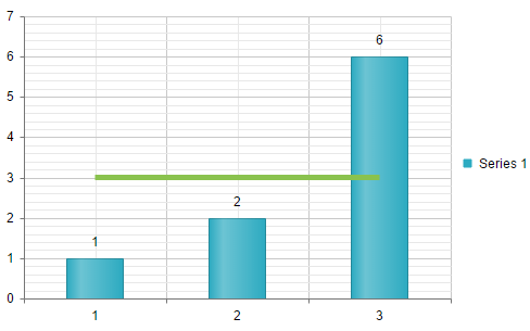
Plot Threshold Lines via Additional Series
You can plot a threshold line in the RadHtmlChart by adding a line series and disabling its visibility in the legend as well as the visiblity of its markers and labels. Example 3 shows this approach and Figure 3 displays the output.
Example 3: Plot a threshold line by simply including an additional line series.
<telerik:RadHtmlChart runat="server" ID="RadHtmlChart1" Width="500px" Height="300px" Skin="Silk">
    <PlotArea>
        <Series>
            <telerik:ColumnSeries Name="Series 1">
                <SeriesItems>
                    <telerik:CategorySeriesItem Y="1" />
                    <telerik:CategorySeriesItem Y="2" />
                    <telerik:CategorySeriesItem Y="6" />
                </SeriesItems>
            </telerik:ColumnSeries>
            <telerik:LineSeries VisibleInLegend="false">
                <LineAppearance Width="5" />
                <MarkersAppearance Visible="false" />
                <LabelsAppearance Visible="false"></LabelsAppearance>
                <SeriesItems>
                    <telerik:CategorySeriesItem Y="3" />
                    <telerik:CategorySeriesItem Y="3" />
                    <telerik:CategorySeriesItem Y="3" />
                </SeriesItems>
            </telerik:LineSeries>
        </Series>
        <XAxis>
            <Items>
                <telerik:AxisItem LabelText="1" />
                <telerik:AxisItem LabelText="2" />
                <telerik:AxisItem LabelText="3" />
            </Items>
        </XAxis>
    </PlotArea>
</telerik:RadHtmlChart>
Figure 3: Line series is used as a threshold line.
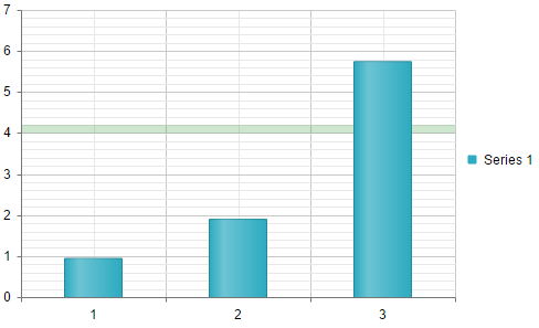
Plot Threshold Lines via Plot Bands
You can display threshold lines in the RadHtmlChart by drawing Plot Bands. Example 4 shows this approach and Figure 4 displays the output.
Example 4: Plot a threshold line by drawing a plot band.
<telerik:RadHtmlChart runat="server" ID="RadHtmlChart1" Width="500px" Height="300px" Skin="Silk">
    <PlotArea>
        <YAxis>
            <PlotBands>
                <telerik:PlotBand From="4" To="4.2" Color="Green" Alpha="200" />
            </PlotBands>
        </YAxis>
        <Series>
            <telerik:ColumnSeries Name="Series 1">
                <SeriesItems>
                    <telerik:CategorySeriesItem Y="1" />
                    <telerik:CategorySeriesItem Y="2" />
                    <telerik:CategorySeriesItem Y="6" />
                </SeriesItems>
            </telerik:ColumnSeries>
        </Series>
        <XAxis>
            <Items>
                <telerik:AxisItem LabelText="1" />
                <telerik:AxisItem LabelText="2" />
                <telerik:AxisItem LabelText="3" />
            </Items>
        </XAxis>
    </PlotArea>
</telerik:RadHtmlChart>
Figure 4: Plot band is used as a threshold line.