ScatterLine Chart
The ScatterLine chart is very similar to the Scatter chart—it shows data as points defined by their items' values. Its x-axis is also numerical and does not require items. The main difference between ScatterLine charts and Scatter charts is that thesubsequent points are connected with lines and thus it can account for missing values in a series. You'll use ScatterLine charts for showing the relation between different sets of data, for example scientific (experimental) results, or when you need to havetwo numerical axes on a line-type chart. Since Q1 2014 ScatterLineSeries can be visualized with spline curves. This Help article shows which properties to use to customize a ScatterLine chart (Figure 1) and shows sample code (Example 1) to create one.
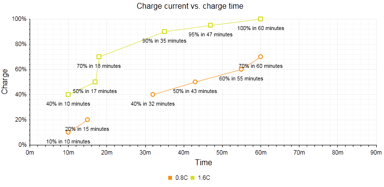
Figure 1: A simple ScatterLine chart comparing two sets of data over time. The code in Example 1 shows how to customize the chart using the MissingValues property to account for a gap in data in the 0.8C ScatterLineSeries.
You can customize the ScatterLine chart:
The color of each series is controlled via the BackgroundColor property of the ScatterLineSeries -> Appearance -> FillStyle inner tag.
The width of the line in each series is controlled via the Width property of the ScatterLineSeries -> LineAppearance tag.
The name that is shown in the legend is set via the
Nameproperty of the series. You can hide the series from the legend either by omitting it, or by setting theVisibleInLegendproperty tofalse.The position of each item on the y-axis is controlled by its Y property of the ScatterSeriesItem and the position of those items according to the x-axis is set with the X property.
Each item can have a label and a tooltip that follows the common pattern defined in the DataFormatString property of the LabelsAppearance and TooltipsAppearance sections of the series.The format string uses the X of the item for the first placeholder and the Y for the second placeholder. You can also load custom text from data source fields in labels and tooltips by using the composite ClientTemplate property.
The markers are fully customizable—the type, background color, size, border's width and color can be controlled respectively through MarkersType, BackgroundColor, Size, BorderWidth and BorderColor properties, exposed by the ScatterLineSeries -> MarkersAppearance tag.
-
The axes are also fully customizable—they automatically adjust the scale to accommodate the data that comes in and for finer tuning there are numerous properties that can change each aspect:
Directly in the axis tag you can use its properties to control color, major and minor tick types and sizes, minimal and maximal values for the-Y axis (plus a step size).This is also the place where the crossing value with the other axis can be set and whether the axis will be reversed.
The inner tags of the axis tag can control the major and minor grid lines in terms of colour and size and the labels can have a DataFormatString, position and visibility set through each inner tag's properties.
If some values are missing (i.e. they are null/Nothing) from the series data you can have the chart work around this by setting the MissingValues property of the series to the desired behavior—interpolate, missing or gap.
The title, background colors and legend are controlled via the inner properties of the RadHtmlChart control and are common for all charts.You can find more information in the Server-side APIand in the Element structure articles.
The ScatterLine chart from Figure 1 is created with the code in Example 1:
Not all properties are necessary. The RadHtmlChart will match the axes to the values if you do not declare explicit values, steps and tick properties.
Example 1: Creating a ScatterLine chart that compares two sets of static data over a time period with customized properties. The property for MissingValues is set to Gap for the 0.8C ScatterLineSeries.
<telerik:RadHtmlChart runat="server" ID="ScatterLineChart1" Transitions="true">
    <PlotArea>
        <Series>
            <telerik:ScatterLineSeries Name="0.8C" MissingValues="Gap">
                <LabelsAppearance DataFormatString="{1}% in {0} minutes" Position="Below" />
                <MarkersAppearance MarkersType="Circle" />
                <SeriesItems>
                    <telerik:ScatterSeriesItem X="10" Y="10" />
                    <telerik:ScatterSeriesItem X="15" Y="20" />
                    <telerik:ScatterSeriesItem />
                    <telerik:ScatterSeriesItem X="32" Y="40" />
                    <telerik:ScatterSeriesItem X="43" Y="50" />
                    <telerik:ScatterSeriesItem X="55" Y="60" />
                    <telerik:ScatterSeriesItem X="60" Y="70" />
                </SeriesItems>
            </telerik:ScatterLineSeries>
            <telerik:ScatterLineSeries Name="1.6C">
                <LabelsAppearance DataFormatString="{1}% in {0} minutes" Position="Below" />
                <MarkersAppearance MarkersType="Square" />
                <SeriesItems>
                    <telerik:ScatterSeriesItem X="10" Y="40" />
                    <telerik:ScatterSeriesItem X="17" Y="50" />
                    <telerik:ScatterSeriesItem X="18" Y="70" />
                    <telerik:ScatterSeriesItem X="35" Y="90" />
                    <telerik:ScatterSeriesItem X="47" Y="95" />
                    <telerik:ScatterSeriesItem X="60" Y="100" />
                </SeriesItems>
            </telerik:ScatterLineSeries>
        </Series>
        <XAxis AxisCrossingValue="0" Color="Black" MajorTickType="Outside" MinorTickType="Outside"
            Reversed="false" MinValue="0" MaxValue="90" Step="10">
            <LabelsAppearance DataFormatString="{0}m" RotationAngle="0" />
            <MajorGridLines Color="#EFEFEF" Width="1" />
            <MinorGridLines Color="#F7F7F7" Width="1" />
            <TitleAppearance Position="Center" RotationAngle="0" Text="Time" />
        </XAxis>
        <YAxis AxisCrossingValue="0" Color="Black" MajorTickSize="1" MajorTickType="Outside"
            MaxValue="100" MinorTickSize="1" MinorTickType="Outside" MinValue="0" Reversed="false"
            Step="20">
            <LabelsAppearance DataFormatString="{0}%" RotationAngle="0" />
            <MajorGridLines Color="#EFEFEF" Width="1" />
            <MinorGridLines Color="#F7F7F7" Width="1" />
            <TitleAppearance Position="Center" RotationAngle="0" Text="Charge" />
        </YAxis>
    </PlotArea>
    <ChartTitle Text="Charge Current vs. Charge Time">
    </ChartTitle>
    <Legend>
        <Appearance Position="Bottom" />
    </Legend>
</telerik:RadHtmlChart>