Set style on mouse over
Sometimes, it may be necessary to style a given row/header in Telerik RadGrid, whenever the user hovers with the mouse over it. With RadGrid this functionality is easily achievable. The control provides a CSS class like GridRowOver_
.GridRowOver_[SkinName]
{
background-color: orange;
cursor:pointer;
}
To enable the hover style for the grid rows, merely set the ClientSettings -> EnableRowHoverStyle property of RadGrid to true.
This depends on RadGrid client-side object. For performance reasons, the RadGrid client object is available only when certain client features/events are enabled. If no client features/events are available in the grid but you still need this functionality, you can attach an empty javascript function to a client event (for example OnRowClick).
If you want to attain the same functionality without the built-in feature of RadGrid for ASP.NET AJAX or with disabled skins, the steps below show how to achieve this:
Create the Telerik RadGrid instance and the data source to which it will be bound.
-
Create a style class, in the head section of the .aspx code, which will be used to style the active row/header. This may look something like this:
CSS
-
This particular approach relies on the OnRowMouseOver, OnRowMouseOut, OnColumnMouseOver and OnColumnMouseOut client-side functions, to use the style mentioned above. Declare these functions in the ClientSettings ->ClientEvents section of the grid declaration like this:
ASP.NET
-
Before the grid tag on the page or in the head section, include the client-side JavaScript functions mentioned above:
JavaScript
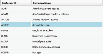
After these steps have been performed, when the user hovers with the mouse over the control, the styles mentioned above will be applied, as shown in the following screenshot: