Radial
The RadRadialGauge represents the ranges and the value in a circular format, much like a car dashboard.In a similar manner it offers a customizable dial and a pointer, that rotates around its cap to show the value on the scale. For example:
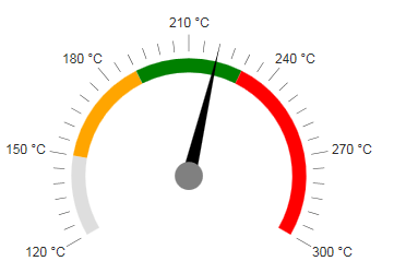
To get a better idea which element corresponds to which tag check the RadGauge Structure article.The above gauge was created with the following simple markup:
<telerik:RadRadialGauge runat="server" ID="RadRadialGauge1" Height="350px" Width="350px">
<Pointer Value="220" Color="Black">
<Cap Color="Gray" Size="0.1" />
</Pointer>
<Scale Min="120" Max="300" MajorUnit="30" MinorUnit="5">
<Labels Format="{0} °C" Position="Outside" />
<Ranges>
<telerik:GaugeRange Color="Orange" From="150" To="190" />
<telerik:GaugeRange Color="Green" From="190" To="230" />
<telerik:GaugeRange Color="Red" From="230" To="300" />
</Ranges>
</Scale>
</telerik:RadRadialGauge>
The control offers more customization options than the ones shown above:
Advanced pointer customizations - The arrow is customizable in terms of Value and Color. The Cap (the axis around which the arrow rotates) offers the Color and Size properties. The size is a percentage of the whole dial and its value must be between [0;1].
Basic Scale configuration - the Scale is the main wrapper of the control and details are configurable through inner properties. The main Scale tag, however, offers the basic functionality - the Min and Max values of the gauge, the MajorUnit and MinorUnit properties that control the ticks and label distance,and the Reverse property which shows the higher values first when set to true. The specific properties here areStartAngle and EndAngle which control the angle from which the gauge's dial starts and at which it ends.The difference between them must be less than 360 degrees and they can also take negative values so that the gauge rotates from the default vertical centring. The zero angle is horizontal to the left.
Labels configuration - you can choose the BackgroundColor, Color and Font to customize their appearance.The Visible property controls if they are shown and the Format takes a format string that will be applied to the text according to the value. The format string uses the {0} placeholder to indicate the value.The Template property is a client template similar to the format - it takes a similar string to show in the labels,but the value placeholder is #=value#. The Position property controls whether the labels are inside or outside of the dial.
Ticks configuration - the MajorTicks and MinorTicks inner tags expose the small lines that protrude from the ranges to show the value. They can be customized in terms of Color, Size or Width (in pixels) and Visibility (boolean).
Ranges configuration - the Ranges tag contains several GaugeRange tags that represent the areas of the gauge that will show differently than the regular scale. Each range has the From and To properties that control is positioning on the scale and also the Color property that can be used to specify their fill.
Main gauge configuration - the Appearance tag of the control allows for customizing its entire look. Currently it offers the BackgroundColor property which sets the wrapper's background fill.