Structure Overview
The structure of the docking controls are described below.
RadDock
RadDock is a movable content placeholder, which can be dragged around the screen, docked into RadDockZone controls, collapsed, expanded, pinned, and so on.
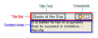
The main visual elements of the control are:
Title Bar - this is the upper part of the control. It is the container of the Title Text and the Commands.
To customize the title bar, use the Title property or the TitleBarTemplate.
To customize the commands, use the DefaultCommands or Commands property.
Content Area - this is the lower part of the control. It can be customized using Text property or the ContentTemplate.
RadDockZone
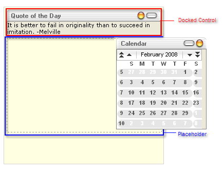
RadDockZone is a static placeholder, where you can dock RadDock controls. It can also display a placeholder to show the position where a RadDock control is about to be docked.
RadDockLayout
RadDockLayout is the control that is responsible for automatic position management of the RadDock controls on the page. It has no visual representation on the client. At design time, you must place all RadDockZone and RadDock controls into the RadDockLayout control so that it can manage their layout. Otherwise, the layout of RadDockZone and RadDock controls will not persist after a postback.
By handling the SaveDockLayout and LoadDockLayout events you can easily implement applications which persist the RadDock controls' positions in a database or other storage medium.