Skins
The RadInput controls use skins to control their overall look-and-feel. A skin is a set of images and a CSSstylesheet that can be applied to the control elements (textbox, buttons, label) and defines their look and feel. To apply a skin to a RadInput control, set its Skin property, either using the properties pane or the input control's Smart Tag.
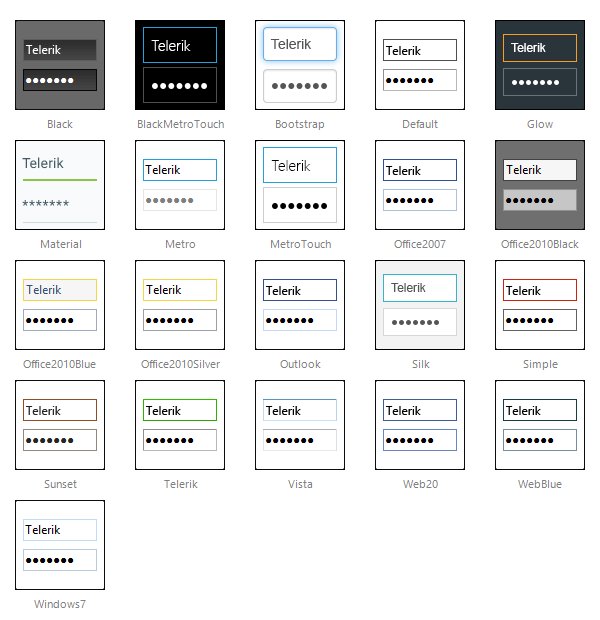
The RadInput controls are installed with a number of preset skins. These are shown below:
The Material skin is available for the Lightweight RenderMode only. If you experience visual issues with it, make sure your controls are not using the default Classic mode.
Not using skins
If you do not set the Skin property, the RadInput control automatically uses the "Default" skin. If you do not want to use a skin with your RadInput control, set its Skin property to an empty string. If you also want to prevent the control's base stylesheet from registering, please set EnableEmbeddedBaseStylesheet to false. The base stylesheet contains CSS styles, which are applied to the RadInput control instances, regardless of their skin name, because these styles are the same for all skins. The RadInput base styles include alignment, border widths, paddings, etc.
When the input control is not skinned, its wrapper element class is rendered without the suffix "_[SkinName]" and the textbox element has no CSS class at all. The latter facilitates textbox styling with RadFormDecorator or with some generic CSS styles from the web application. By default (when not skinned) the input element is rendered with border 2px and padding 1px. The default rendering of the input area has the style attribute "width: 100%" and is nested in a table cell. In IE, this causes the right border to be cut off. You can correct for this problem by setting padding-right to be twice the border (for both the left and the right side of the input). That is, you should set the "padding-right: 6px". The CSS class RadInput is rendered to the input wrapper element, so you can apply the padding setting to it as shown below:
<head runat="server">
    <style type="text/css">
        .RadInput, .RadInput table
        {
            padding-right: 6px;
        }
    </style>
</head>
<body class="body">
    <form runat="server" id="mainForm" method="post">
    <asp:ScriptManager ID="ScriptManager1" runat="server">
    </asp:ScriptManager>
    <telerik:RadDateInput RenderMode="Lightweight" ID="RadDateInput1" runat="server" EnableEmbeddedSkins="false" Skin="">
    </telerik:RadDateInput>
    </form>
</body>
Customizing Skins
You can tweak the existing skins, or create your own. Each skin has two main elements: images and a stylesheet. When creating your own skin, it is a good idea to start with the stylesheet of an existing skin and alter that. See Tutorial: Creating a Custom Skin for a step-by-step walk through. To use your own skin:
Add the new CSS file to your project.
Drag and drop the CSS file from the Project Explorer onto your Webpage.
Set the EnableEmbeddedSkins property of the input control to False.
The RadInput base stylesheet is called Input.css and is placed in the ...Skins/ directory. The stylesheet for a RadInput skin has the name Input.[SkinName].css and can be found in the ...Skins/[SkinName] directory. The images are found in the ...Skins/[SkinName]/Input directory. For example, the stylesheet for the "Black" skin is called Input.Black.css * and is located in the ...Skins/Black* directory. The images are found in the ...*Skins/Black/Input * directory. The images are referenced by name from within the stylesheet.
For more information on the CSS File structure, see Understanding the Skin CSS File.