Elastic Design
This article explains the elastic design capabilities RadButton offers. The examples below show the basic approaches you can use to scale the control by only changing its default font size.
Generally, responsive design means that the page and its content are able to adapt to different screen resolutions without deteriorating the user experience. This often includes changing the font size and having dimensions set in percent.
Elastic Design with Lightweight Render Mode
The Lightweight Render Mode is available since Q1 2015.
Figure 1: Comparison between appearance of a RadButton with Lightweight render mode with regular font size and with increased font size
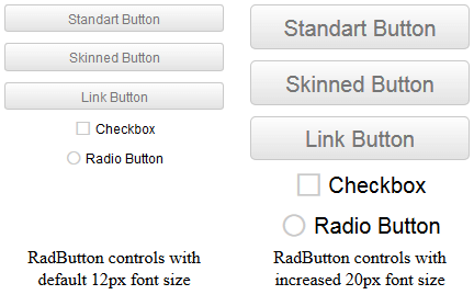
As of 2016 Q1 SP1 RadButton takes the font-size of the page automatically. If the developer does not set it explicitly (Example 1), this is up to the client's browser and a common default value is 16px.
Example 1: Setting default font for the page with the default value for the Telerik controls.
body {
    font-size: 20px;
    font-family: "Segoe UI", Arial, Sans-serif;
}
Example 2: Shows how to increase the font size of a RadButton with Lightweight render mode as shown in Figure 1.
<style type="text/css">
    button.RadButton,
    span.RadButton {
        font-size: 20px;
    }
</style>

<telerik:RadButton runat="server" ID="StandartButton" RenderMode="Lightweight"
    Text="Standart Button" ButtonType="StandardButton" Skin="Silk" Width="200px">
</telerik:RadButton>

<telerik:RadButton runat="server" ID="SkinnedRadButton" RenderMode="Lightweight"
    Text="Skinned Button" ButtonType="SkinnedButton" Skin="Silk" Width="200px">
</telerik:RadButton>

<telerik:RadButton runat="server" ID="LinkRadButton" RenderMode="Lightweight"
    Text="Link Button" ButtonType="LinkButton" Skin="Silk" Width="200px">
</telerik:RadButton>

<telerik:RadButton runat="server" ID="Checkbox" RenderMode="Lightweight"
    Text="Checkbox" ButtonType="ToggleButton" ToggleType="CheckBox" Skin="Silk" Width="200px">
</telerik:RadButton>

<telerik:RadButton runat="server" ID="RadioButton" RenderMode="Lightweight"
    Text="Radio Button" ButtonType="ToggleButton" ToggleType="Radio" Skin="Silk" Width="200px">
</telerik:RadButton>
Elastic Design with Classic Render Mode
Figure 2: Comparison between appearance of a RadButton with Classic render mode with regular font size and with increased font size
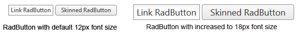
RadButton with Classic render mode provides two Button Types that are built semantically, using CSS for defining rounded corners, shadows and gradients.They are LinkButton and SkinnedButton.In the example below you will find a basic approach that enables you to resize and scale these buttons only by changing the default font size.
Example 3: Shows how to increase the font size of a RadButton with Lightweight render mode as shown in Figure 2.
<style type="text/css">
    span.RadButton
    {
        font-size: 18px;
    }
</style>

<telerik:RadButton ID="RadButton1" runat="server" Text="Link RadButton" ButtonType="LinkButton">
</telerik:RadButton>

<telerik:RadButton ID="RadButton2" runat="server" Text="Skinned RadButton" ButtonType="SkinnedButton">
</telerik:RadButton>
RadButton does not create elastic design by itself, but can fit in a page that follows this pattern. This elastic layout is achieved by using em units for setting dimensions and paddings in the control, instead of pxbecause em units are tied to the font size. This allows dimensions and sizes to scale with the font size.
Elements that use images or images sprites, however, cannot be increased in size, so if you are using any icons they will keep having their original dimensions and position.The horizontal aligning of the icons also has to be handled manually.